SDK components
This toolkit is designed to provide developers with a collection of ready-to-use UI components that can enhance the functionality and aesthetics of a Mini. From interactive buttons to complex templates, our SDK aims to streamline your Mini development process, ensuring a rich user experience and adherence to modern design standards.
Getting Started
Before you dive into using these components, make sure your project environment is set up with access to @shopify/shop-minis-platform-sdk.
See the quickstart for requirements and to set up a Shop Mini.
Importing Components
You can import components from the SDK like this:
import {ShoppablePost, Avatar, Button} from '@shopify/shop-minis-platform-sdk'
Use these components within your React components to enhance your application.
SDK Components
Below are some of the key components available in this SDK along with a brief description of their functionality:
Accordion
A collapsible container that can be expanded or collapsed to show or hide content.
Avatar
An image and text that represents a user or entity.

Badge
A small visual indicator that can be used to display a status or a count.
- View more
Box
A container that can be used to group and style other components.
Button
A clickable element that can be used to trigger an action.
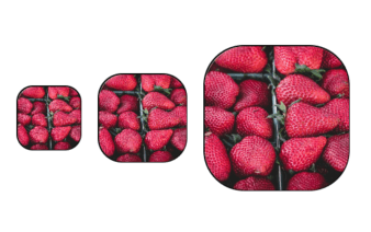
CollectionThumbnail
A visual representation of a collection that can be used to navigate to a collection page.
- View more
CompactVariantPicker
A compact variant picker that can be used to select a product variant through a bottom sheet.
- View more
DatePicker
A component that allows the user to select a date.
- View more
Divider
A horizontal line that can be used to separate content.
FavoritesButton
A button that can be used to add or remove an item from a list of favorites.
- View more
FormatMoney
A component that formats a number as a currency string.
- View more
Grid
A layout component that arranges its children in a grid.
Icon
A visual representation of an icon that can be used to convey meaning or trigger an action.
IconButton
A button that displays an icon and can be used to trigger an action.
- View more
ImageBox
A container that displays an image with optional text overlay.
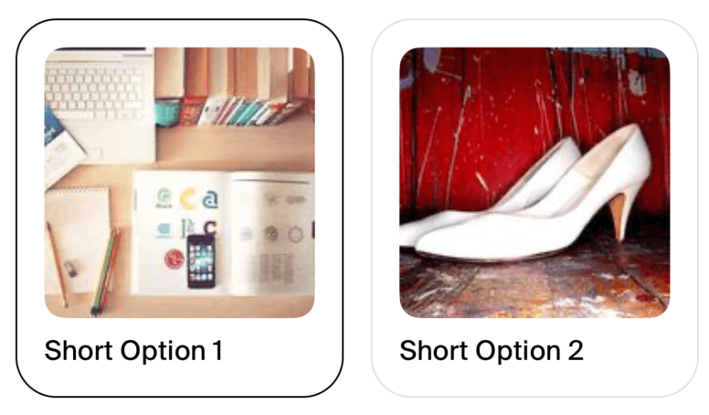
ImageMultipleChoice
A component that displays a list of images and allows the user to select one.

- View more
KeyboardAvoidingView
A component that adjusts its size and position to avoid the keyboard.
MultipleChoice
A component that displays a list of options and allows the user to select one or more.
- View more
Picker
A component that displays a list of options and allows the user to select one.
- View more
PressableAnimated
A component that animates when pressed.
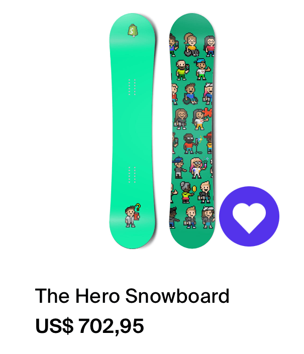
ProductCard
A card that displays information about a product.

- View more
ProductCardGrid
A grid of product cards that can be used to display multiple products.
ProductLink
A link that navigates to a product page.
- View more
ProductVariantPrice
A component that displays the price of a product variant.
ProgressIndicator
A component that displays a progress indicator.
QuantityPicker
A component that allows the user to select a quantity.
RadioPickerItem
A component that represents an option in a radio picker.
- View more
SafeAreaView
A component that ensures its children are not obscured by the device's status bar, navigation bar, or notch.
- View more
ScreenWidthContainer
A container that adjusts its size to the width of the screen.
Selector
A component that allows the user to trigger and select an option from a list.
- View more
ShareEmail
A component that can be used to share user email.
Shelf
A container that displays a list of items in a horizontal scrollable view.
Spinner
A component that displays a loading spinner.
- View more
Text
A component that displays text.
- View more
TextField
A component that allows the user to input text.
- View more
ToggleButton
A button that toggles between two states.
- View more
TouchableProduct
A component that displays a product and can be used to navigate to a product page.
- View more
TrackingPixel
A component that sends a tracking pixel request.
- View more
VariantPicker
A component that allows the user to select a product variant.
- View more
WebView
A component that displays a web view.