Design principles for Shop Minis
1. All content should be shoppable and actionable
- If a product, variant, or merchant isn't attached to the content, it should be hidden or filtered out.
- Products must use the a product component from the Shop Minis SDK to ensure consistent presentation and functionality, like
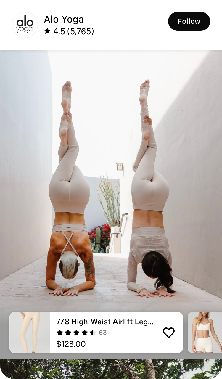
<ProductLink />or<ProductCard /> - Merchants should be displayed with an
<Avatar />and their full name for easy identification. - Consider including a "Follow" button to allow users to follow merchants and receive updates from them.
- If space permits, it's recommended to include a brief description of the merchant.
| Do | Don't |
|---|---|
 |  |
Example
For shoppable posts (Instagram) Shop Mini, if there are posts that don’t have any tagged products hide them inside the Shop Mini.
Actions to be taken
- Remind and incentivize merchants to tag products in posts
2. Avoiding Dead Ends and Providing Navigation
- Ensure that every page or screen provides a clear path for users to navigate further or return to previous sections. Avoid situations where users reach a dead end with no way to proceed or go back.
- For apps that utilize full-page paging navigation, such as TikTok, consider providing a hint or visual cue when launching the app to guide users on how to navigate through the content.
- Should not stop the user from interacting with the content
- Could be the UI shifting/hinting or a light overlay that’s dismissed immediately when the user touch the interface
- If needed, include a prominent and consistent navigation menu or toolbar that allows users to access different sections or features of the Shop Mini from anywhere within the viewer.
- Include a back button in the navigation bar or as a gesture to allow users to navigate back to the previous screen or section. This helps users maintain a sense of context and easily backtrack within the Shop Mini.
- Provide contextual links or related content suggestions to guide users to relevant information or related features that they might find useful.
- Use clear and descriptive labels for navigation elements to help users understand where they will be directed when they tap on them.
- Use intuitive icons or labels for navigation elements to help users understand their purpose and functionality.
Example
For a shoppable video Shop Mini, you want videos to be full-view with overlaying information. Add a subtle animation of the first video sliding up to reveal the next video below and then go back to its natural state. This way you’re indicating that there’s more to discover but you’re not stopping the user from watching or dismissing any overlays
Actions to be taken
- Invest extra time and effort into creating high-quality hints within the Shop Mini can significantly enhance user engagement and contribute to the success of both the Shop Mini and the merchants, ensuring a better user experience and improved outcomes.
3. Privacy
- Collect only necessary information from users and avoid gathering any unnecessary data
- Ensure that the app's content does not contain racist material, prolonged graphic violence, graphic sexual content, or nudity.
- Prohibit the sale or promotion of paid functionality within the app, as well as advertising for separate services.
- Do not collect user data without explicit consent and without utilizing the platform's designated components (such as email, phone number, address, etc.).
- Safeguard user data by implementing appropriate security measures to protect against unauthorized access or data breaches.
- Comply with relevant privacy laws and regulations, such as GDPR or CCPA, to ensure the protection of user privacy rights.
- Provide clear and transparent information to users about the types of data collected, how it will be used, and any third parties with whom it may be shared.
- Regularly review and update privacy policies and practices to align with evolving privacy standards and user expectations.
4. Performance
- Prioritize performance by ensuring that the Shop Mini is fast and responsive, providing a smooth user experience.
- Fetch content in smaller chunks rather than loading large blobs of data, allowing for faster rendering and improved user perception of speed.
- Implement pagination or infinite scrolling techniques to load content progressively, reducing initial load times upfront and improving overall performance.
- Utilize caching mechanisms to store and retrieve frequently accessed data, reducing the need for repeated API calls and improving response times.
- Optimize network requests by minimizing unnecessary calls, combining multiple requests when possible, and reducing payload sizes.
- Implement lazy loading techniques to load content only when it becomes visible to the user, improving initial load times and conserving resources.
- Regularly monitor and analyze app performance using tools and metrics to identify bottlenecks and areas for improvement.
- Continuously iterate and optimize the app's performance based on user feedback, analytics, and emerging best practices.
5. Use provided components
- Utilize the provided UI components to ensure seamless integration of Shop. Use the existing UI components to maintain consistency and familiarity for users, providing a cohesive user experience.
- We strive to maintain a consistent look and feel throughout the app, upholding high standards of quality. While we provide a comprehensive set of components, we understand that there may be genuine cases where a custom component is necessary. In such instances, developers are encouraged to communicate their requirement when submitting their Shop Mini for review, ensuring that the custom component aligns with our design principles and quality standards.
- Prior to building a custom component, developers are encouraged to reach out to the Shop Minis team and request the addition of the desired functionality or UI component if it is missing. We will try our best to accomodate so that you can use provided components over custom ones.
- This approach ensures that custom components are only built when necessary, reducing redundancy and maintaining a unified design language across the platform.
Example
You are building a shoppable content Shop Mini and need a component for products that could be tapped and lead to a product. You want to use <ProductLink /> (the preferred component) or <ProductCard /> but it’s missing a variant price range which is key for your use case. Instead of building a custom <ProductLink />, reach out to us and we can iterate on the component and add it as a prop.
Actions to be taken
- Explore and experiment with all the provided components in Shop Minis SDK
6. Use native controls, over webviews
- Minimize the use of webviews within Shop Minis to maintain a consistent and native user experience. Instead use Shop Minis’ React Native UI components
- Webviews should only be used when absolutely necessary and for specific functionalities that cannot be achieved through native components.
- Before implementing a webview, developers must communicate the need and provide a strong justification to the team for review and approval.
- Consider alternative native solutions or components that can achieve the desired functionality before resorting to webviews.
- Be aware that webviews may introduce inconsistencies in appearance and behavior compared to the rest of the app, such as different link highlights or scrolling behavior.
- If a webview is approved for use, ensure that it is styled and themed to match the overall app design as closely as possible.
- Regularly review the usage of webviews and evaluate if any can be replaced with native components or functionalities to improve performance and user experience.
- Prioritize native solutions for better performance, security, and integration with the platform's features and capabilities.
7. Branding
- Custom branding using the merchant's color is allowed and encouraged within the Shop Mini..
- If developers wish to incorporate their own branding, it should be done sparingly and with intention, ensuring it does not overshadow or conflict with Shop’s and the merchant's branding.
- One acceptable example of incorporating custom branding is through a quick splash screen that is only displayed during the loading process and not for an extended duration.
- The purpose of allowing custom branding is to provide a personalized touch while maintaining consistency with the overall Shop design language.
- Custom branding should be used thoughtfully to enhance the user experience and align with the platform's guidelines and aesthetics.
- Regularly review and assess the usage of custom branding to ensure it remains in line with the intended purpose and does not compromise the overall user experience or brand identity.
8. Account creation
- Creation of user accounts within the Shop Minis are not allowed
- Avoid implementing any features or functionalities that impose limits or restrictions based on individual users.
- Keep the app experience seamless and user-friendly, allowing buyers to enjoy content without the need for user-specific accounts or limitations.