Foundations
Accessibility
Screen reader compatibility
Ensure that your app is compatible with screen readers, such as VoiceOver for iOS or TalkBack for Android, by providing proper labeling for UI elements, using semantic markup, and enabling accessibility features like accessibility traits and hints.
Color contrast and visual accessibility
Design your app with sufficient color contrast to accommodate users with visual impairments. Avoid relying solely on color to convey information and provide alternative text for images. Additionally, consider offering customizable font sizes and support for dynamic text to cater to users with different visual needs.
Accessible content and media
Make sure that all content, including text, images, and multimedia, is accessible to users with disabilities. Provide captions or transcripts for videos, alternative text for images, and descriptive labels for interactive elements.
Device text sizes and dynamic text
Consider the varying text size preferences of users on different devices. It's important to design your app to accommodate these preferences and ensure readability for all users. When designing your Shop Mini, make sure to test and optimize the layout and spacing to accommodate different text sizes. Avoid hardcoding font sizes and instead utilize defined size in components, and relative units, or the appropriate APIs provided by the platform to ensure proper scaling.
Shop Minis metadata
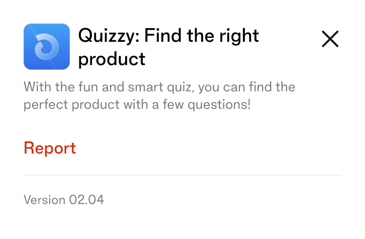
Metadata will show up mainly in the informational bottom sheet that's reachable from the Shop Minis viewer. It is buyer facing and the content should reflect that in the tone of voice and the way the it is written, in comparison to the way the you may write to merchants.

icon_url
The icon should be a square image in PNG or JPG format, with a minimum size of 256x256px. Do not include a border radius in the icon.
name
The name should be limited to 25 characters.
partner_name
The partner name should be limited to 25 characters.
description
The description should be limited to 100 characters.
Icons
- Take advantage of the wide variety of icons available through the
<Icon />component provided. - If you require an additional icon that is not available, feel free to request it, and our team will consider adding it to the icon library.
- In case you need a custom icon, aim to create it in a way that aligns with the style and aesthetic of Shop's existing icons.
- Custom icons should strive to maintain consistency with the existing icon set, ensuring they look and feel cohesive within Shop.
- By leveraging the provided icons and, if necessary, requesting or creating custom ones, you can enhance the visual appeal and usability of your app while maintaining a consistent iconography style.
Typography
- Utilize the wide range of typographic styles available through the
<Text />component provided. - The
<Text />component offers a variety of styles, such as headings, paragraphs, and other text elements, ensuring consistency and coherence throughout the app. - All typographic styles provided by the
<Text />component support accessibility features, including dynamic text sizing, ensuring readability for users with different visual needs. - Please refrain from introducing custom or external typographic styles to maintain a unified and harmonious visual language within the app, enhancing readability and user experience.
Spacing
- Utilize the spacing options provided by the
<Box />components to ensure consistent and appropriate spacing between elements. - Additionally, take advantage of the spacing values offered through the Theme file, ranging from
xxxsto3xlsizes. - By using the provided spacing options and values, you can maintain a consistent and visually pleasing layout throughout the app.
- Avoid introducing custom or arbitrary spacing values to maintain a cohesive design language and ensure a harmonious spacing between elements.
- Consistent spacing enhances readability, visual hierarchy, and overall user experience within the app.
Loading
- Minimize the usage of loading states as much as possible, as outlined in the performance section.
- When loading states are necessary, consider using skeleton loading if the layout is static and predictable. This provides a placeholder representation of the content being loaded.
- If the layout is not predictable, avoid showing a loading state and instead animate the content into view. Ensure that the animation is fast and the origin of the animation makes sense in the context of the loaded element's position.
- For generic loading indicators, utilize the provided
<Spinner />component. This ensures consistency and familiarity for users. - By minimizing loading states, using appropriate loading techniques, and utilizing the
<Spinner />component, you can provide a smooth and efficient loading experience for users.
Error handling
- Handle errors effectively and communicate them clearly to the user, providing information about what went wrong and suggesting possible actions to resolve the error.
- Avoid leaving users at a dead end by ensuring there is always a next action or relevant content available in the current context.
- Utilize the
showErrorScreencomponent to display a dedicated error screen that clearly communicates the error and provides guidance on how to proceed. - Additionally, use the
showErrorToastcomponent to show a toast notification that alerts the user to the error without interrupting their workflow. - Regularly review and update error handling mechanisms to address any new error scenarios and improve the user experience.