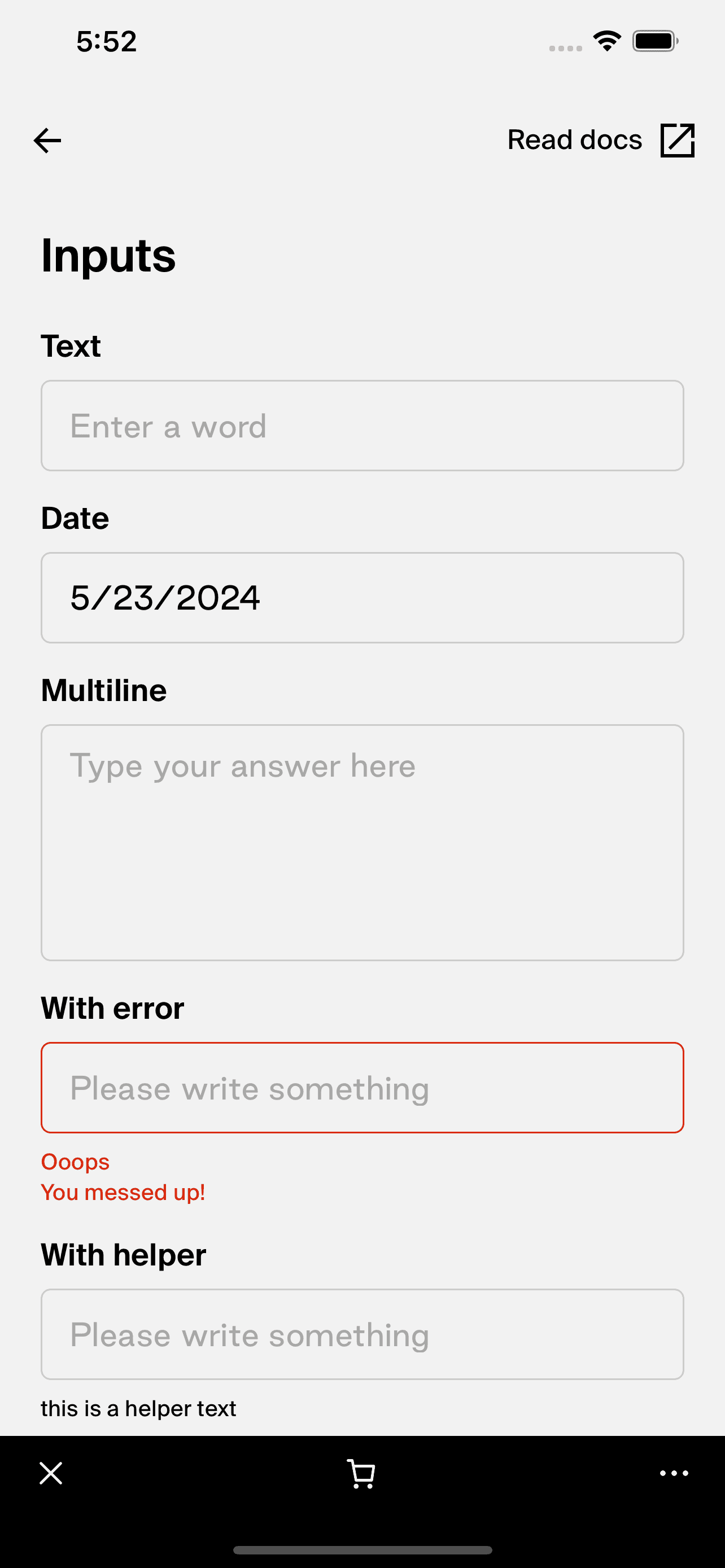
TextField
- The TextField component is a fundamental input control designed for React Native applications, enabling users to enter and edit text. It is highly customizable to accommodate various user interaction scenarios, such as form entries, search fields, or text editing areas. The component provides optional support for leading and trailing add-ons (like icons or action buttons), helper text, error messages, and custom focus handling, adding to its versatility in user interface design.
The
TextFieldcomponent is built using theTextInputfrom React Native, enhanced with additional features like error handling and accessibility improvements for better user experience. It supports toggle features for both controlled and uncontrolled component behaviors, adhering to the best practices in React component design.Here is an implementation example of the
TextFieldcomponent: <TextField
placeholder="Enter your username"
onChangeText={text => console.log(text)}
leadingComponent={<Icon name="user" />}
trailingComponent={<Icon name="check" />}
error="Username is required"
/>

Integration
Requirements:
- Ensure your project environment is set up with access to
@shopify/shop-minis-platform-sdk. See the quickstart for requirements and to set up a Shop Mini.
Step 1: Importing the Component
Start by importing the TextField from your Minis component library:
import {TextField} from '@shopify/shop-minis-platform-sdk'
Step 2: Implementing the TextField
Use the TextField in your forms or input sections by configuring its properties to suit your needs:
<TextField
  placeholder="Enter email"
  onChangeText={email => setEmail(email)}
  leadingComponent={<Icon name="email" />}
  helper="Enter a valid email address"
/>
Examples
Basic Usage:
<TextField
  onChangeText={text => console.log(text)}
  placeholder="Type something here..."
/>
With Error Handling:
<TextField
  error={'Please enter a valid input'}
  onChangeText={text => console.log(text)}
  placeholder="Required field"
/>
Props
- disabled (
boolean): If true, the input field is non-interactive. - error (
string): Displays an error message below the text field. - helper (
string): Additional helpful text below the input field. - leadingComponent (
ReactNode): Component displayed at the start of the text field. - trailingComponent (
ReactNode): Component displayed at the end of the text field. - handleFocus (
() => void): A handler triggered on focus events that can override default editable behavior. - containerStyle (
ViewStyle): Custom style for the outer container of the text field. - paddingHorizontal (
ThemeSpacing): Horizontal padding inside the text field, influenced by theme spacing.
For more details on the props, please refer to the TextField Props.