Text
This documentation is outdated and only applies to partners with existing Minis. Please check back soon for new platform announcements.
- The Text component serves as a foundational element for text manipulation and display in React Native applications. It is an enhanced version of the standard `Text` component provided by React Native, enriched with styling capabilities from the `Shop theme`. This integration facilitates theme-based styling and consistent typography across the app.
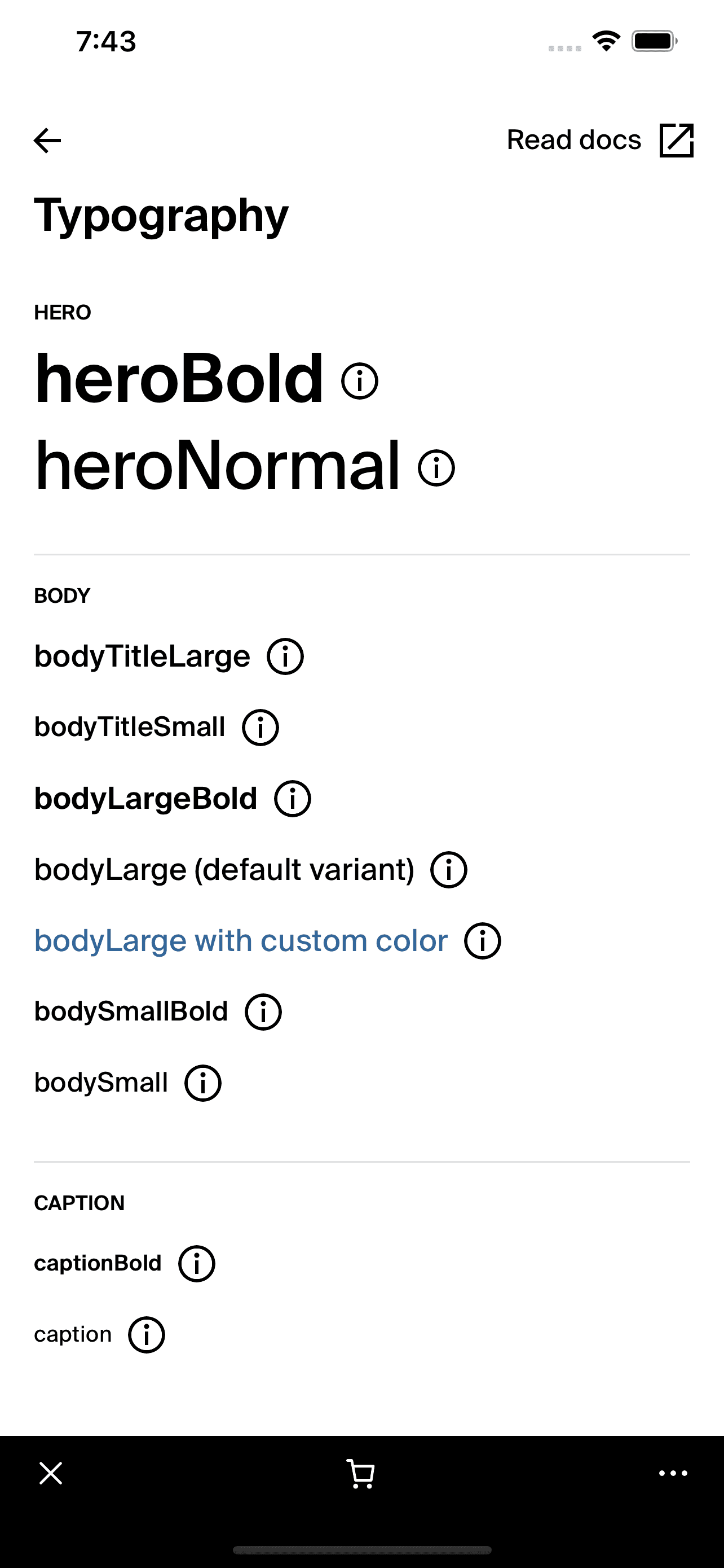
Check out some variants available for the
Textcomponent in the Typography screen scaning the QR code along with the image.Additionally, this component addresses some known alignment issues on Android platforms by conditionally applying fixes for certain text variants to ensure consistent rendering across different devices. This proactive approach improves the text appearance especially on platforms with known issues, such as Android, where
textAlignVerticalandincludeFontPaddingcan cause display irregularities.Here’s an example showcasing the use of the
Textcomponent: <Text variant="headerBold" color="foregrounds-contrast">
Welcome to our application!
</Text>

Requirements:
- Ensure your project environment is set up with access to
@shopify/shop-minis-platform-sdk. See the quickstart for requirements and to set up a Shop Mini.
Integration
Step 1: Importing the Component
Import the Text component from @shopify/shop-minis-platform-sdk:
import { Text } from '@shopify/shop-minis-platform-sdk';
Step 2: Using the Text
Embed the Text component within your application, configuring it with appropriate variants and styling properties to match your design needs:
<Text
  variant="bodyLarge"
  color="foregrounds-primary"
  style={{ paddingHorizontal: 20 }}
>
  This is a sample text with large body style.
</Text>
Examples
Basic Usage:
<Text color="foregrounds-secondary">
  Simple text example.
</Text>
With Additional Styles:
<Text variant="subtitle" style={{ margin: 10 }}>
  Styled subtitle text.
</Text>
Props
- children (
React.ReactNode): The content of the text. - variant (
string, optional): Text style variant defined in the theme, defaults to 'bodyLarge'. - color (
string, optional): Text color defined in the theme, defaults to 'foregrounds-regular'.
For more details on the props, please refer to the Text Props.