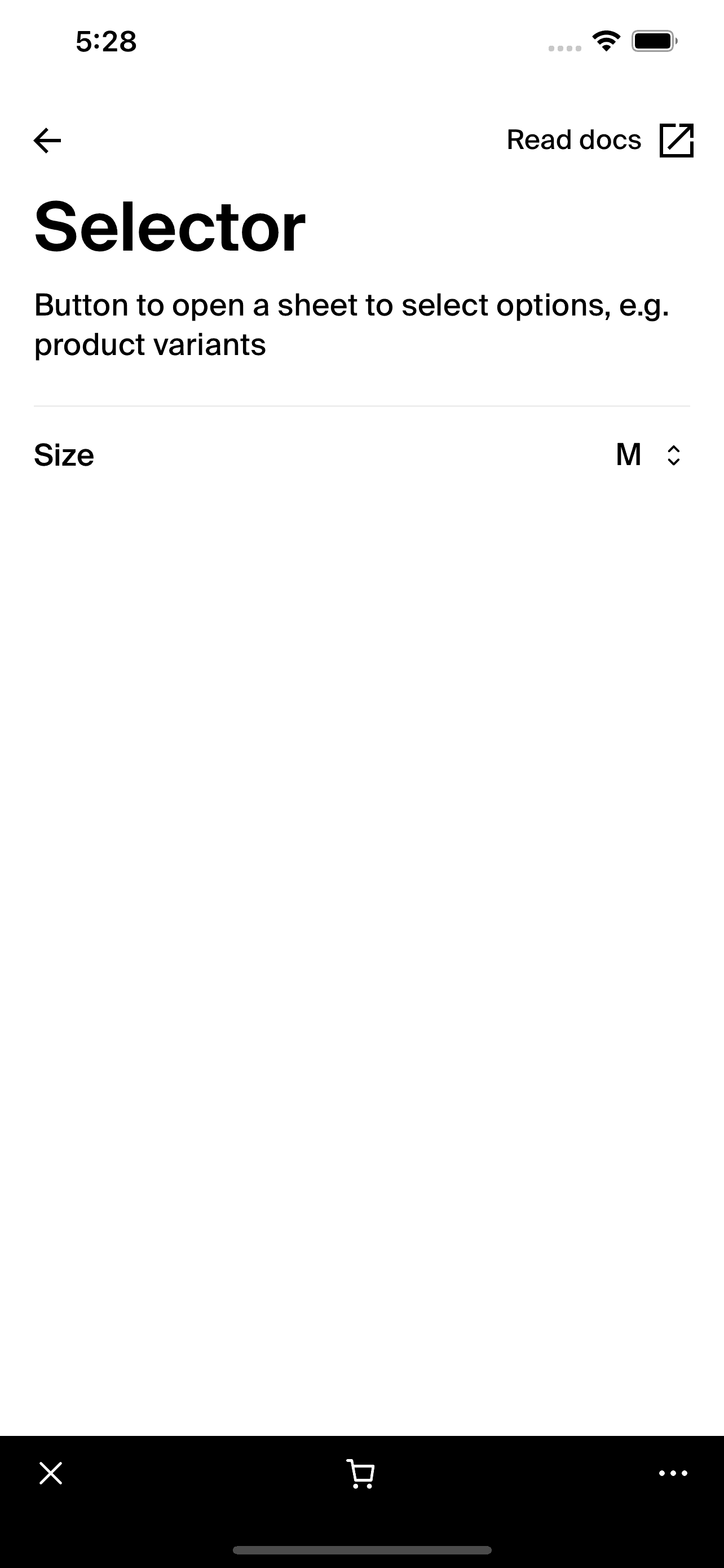
Selector
caution
This documentation is outdated and only applies to partners with existing Minis. Please check back soon for new platform announcements.
- The Selector component is a user interface element designed for React Native applications that offers a clean, interactive way to present selectable options. It combines the utility of a label with an actionable area that reveals additional choices upon interaction. The component fully supports accessibility features, adapting its layout based on the user's font size settings, ensuring usability across a diverse range of user preferences.
The component is structured using a
PressableAnimatedfor touch feedback, anIconto indicate interactivity, andTextelements to display the label and currently selected value. This design not only makes it visually appealing but also highly functional and responsive.Here's an example to implement the
Selectorcomponent effectively within your project: <Selector
label="Size"
selectedValue="M"
onPress={() => console.log("Selector pressed")}
/>

Integration
Requirements:
- Ensure your project environment is set up with access to
@shopify/shop-minis-platform-sdk. See the quickstart for requirements and to set up a Shop Mini.
Step 1: Importing the Component
Import the Selector from minis SDK @shopify/shop-minis-platform-sdk:
import { Selector } from '@shopify/shop-minis-platform-sdk';
Step 2: Using the Selector
Incorporate the Selector into your application's UI by specifying its label, selectedValue, and handling the onPress event:
<Selector
  label="Select Your Country"
  selectedValue="United States"
  onPress={handleCountrySelection}
/>
Examples
Basic Usage:
<Selector
  label="Age Range"
  selectedValue="25-35"
  onPress={() => console.log("Age Range Selector pressed")}
/>
With Dynamic Values:
<Selector
  label="Favorite Color"
  selectedValue={favoriteColor}
  onPress={openColorPicker}
/>
Props
- label (
string): The text label for the selector. - selectedValue (
string?): The current value that is selected which is displayed beside the label. - onPress (
() => void): Function called when the selector is pressed. - testID (
string?Optional): An identifier used for testing purposes.
For more details on the props, please refer to the Selector Props.