RadioPickerItem
This documentation is outdated and only applies to partners with existing Minis. Please check back soon for new platform announcements.
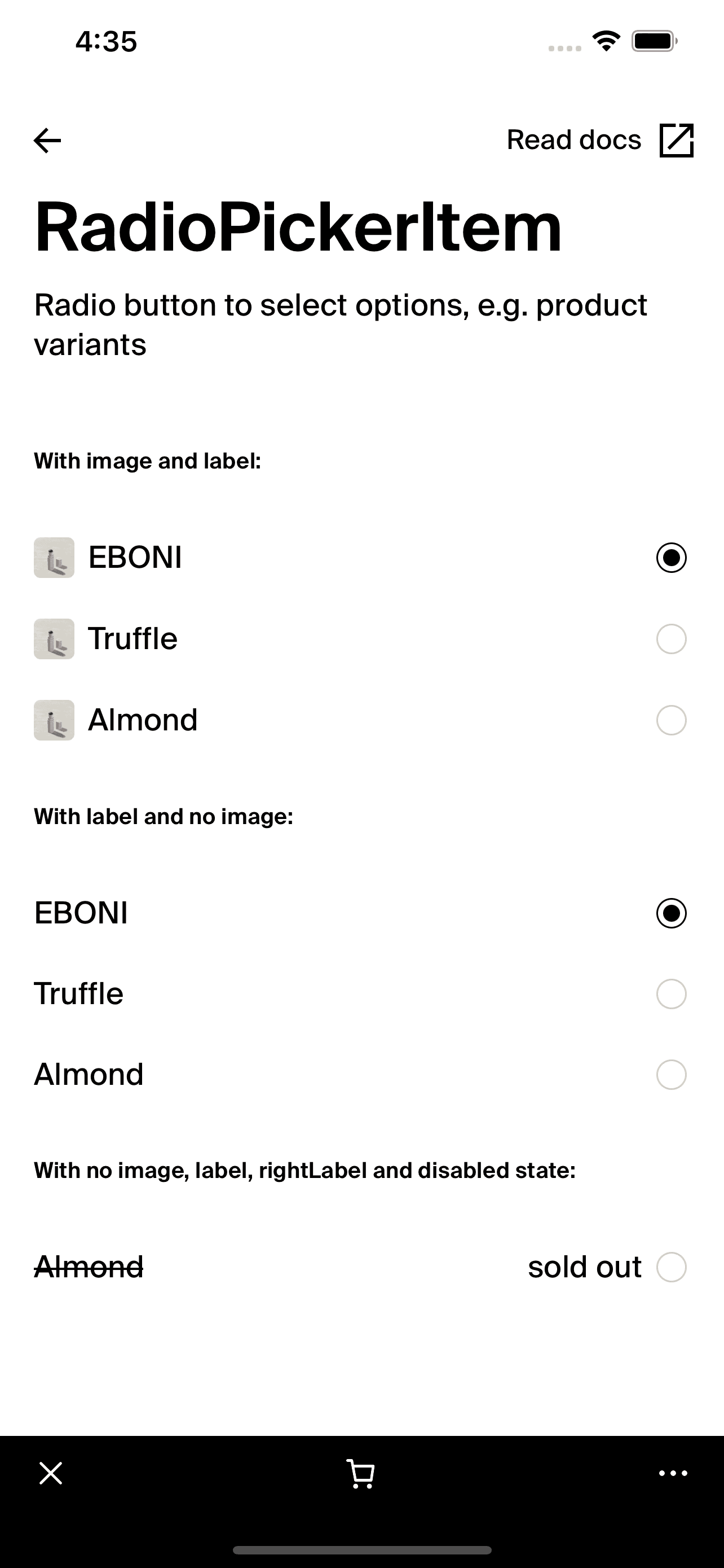
- The RadioPickerItem is a versatile component designed for selection scenarios within a React Native application, offering a clear and accessible way to choose from multiple options. This component combines text, optional images, and a radio button to provide a visually engaging and easy-to-use interface for options. It is especially effective in settings where users need to make a single choice from a list, such as in forms or settings.
The component intelligently adapts to different accessibility settings, such as larger text scales, by adjusting its layout to accommodate larger text while still maintaining a clean and functional design. This adaptability ensures that the component is accessible and user-friendly under various conditions.
Here is a basic example to demonstrate the implementation of the
RadioPickerItemcomponent: <RadioPickerItem
label="Option 1"
rightLabel="Detail"
onPress={() => console.log("Selected Option 1")}
selected={true}
imageUrl="http://example.com/image.png"
/>

Integration
Requirements:
- Ensure your project environment is set up with access to
@shopify/shop-minis-platform-sdk. See the quickstart for requirements and to set up a Shop Mini.
CDN Image Usage:
- For optimal performance, it is recommended to use images hosted on Shopify's CDN (e.g.,
https://cdn.shopify.com/s/files/1/0638/...).
Step 1: Importing the Component
Start by importing the RadioPickerItem from your component directory:
import { RadioPickerItem } from '@shopify/shop-minis-platform-sdk';
Step 2: Implementing the RadioPickerItem
Deploy the RadioPickerItem within your application, providing it with the necessary callbacks, labels, and optional image URLs:
<RadioPickerItem
  label="Choice A"
  onPress={() => handleSelection('A')}
  selected={selectedItem === 'A'}
  imageUrl="http://example.com/choice-a.png"
/>
Examples
Basic Usage:
<RadioPickerItem
  label="Option 2"
  onPress={() => console.log("Selected Option 2")}
/>
With Image and Additional Right Label:
<RadioPickerItem
  selected={selectedItem === item.label}
  label={item.label}
  onPress={() => handleSelectItem(item.label)}
  imageUrl={item.imageUrl}
  loading={false}
/>
Props
- label (
string?): Main text label for the item. - onPress (
() => void): Function to execute when the item is pressed. - selected (
boolean, optional): Whether this item is currently selected. - loading (
boolean, optional): If the item is in a loading state. - disabled (
boolean, optional): If set, the item will be non-interactive. - imageUrl (
string, optional): URL for an image to display alongside the text. - rightLabel (
string, optional): Additional label text displayed to the right of the main content.
For more details on the props, please refer to the RadioPickerItem Props.