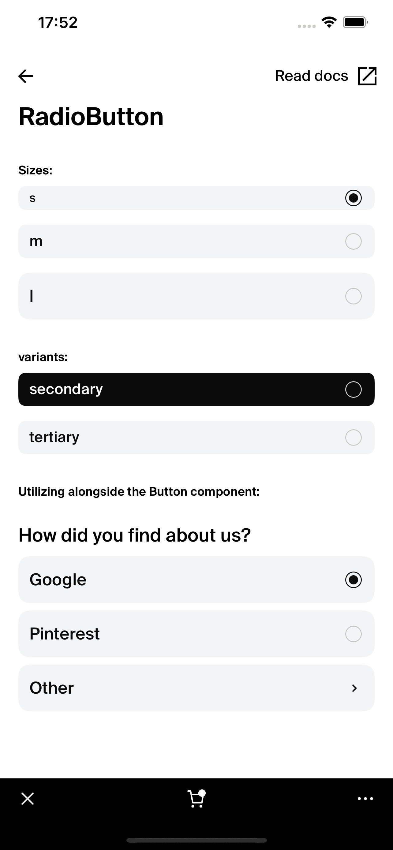
RadioButton
This documentation is outdated and only applies to partners with existing Minis. Please check back soon for new platform announcements.
- The RadioButton component is a customizable UI element designed for selecting one option from a set. It is typically used in forms and surveys where a user must choose one option from multiple available choices.
The
RadioButtoncomponent allows for some customization through props to fit different use cases, ensuring it integrates seamlessly into the overall design of your application. It supports different sizes, padding adjustments, and color variants, making it versatile for various UI requirements. <RadioButton
text="Option A"
onPress={() => console.log('Selected Option A')}
active={true}
variant="secondary"
/>

Integration
Requirements:
- Ensure your project environment is set up with access to
@shopify/shop-minis-platform-sdk. See the quickstart for requirements and to set up a Shop Mini.
Step 1: Importing the Component
Firstly, ensure the RadioButton component is accessible by importing it at the top of your file:
import {RadioButton} from '@shopify/shop-minis-platform-sdk'
Step 2: Using the RadioButton Component
Incorporate the RadioButton into your component structure by using it in the return statement of your component, providing all necessary props as needed:
<RadioButton
  text="Option B"
  onPress={() => console.log('Selected Option B')}
  active={false}
  variant="tertiary"
/>
Examples
Basic Usage:
<RadioButton
  text="Option A"
  onPress={() => console.log('Selected Option A')}
  active={true}
/>
With Custom Size and Padding:
<RadioButton
  text="Option C"
  onPress={() => console.log('Selected Option C')}
  size="l"
  paddingHorizontal="m"
  active={false}
/>
Secondary Variant:
<RadioButton
  text="Option D"
  onPress={() => console.log('Selected Option D')}
  variant="secondary"
  active={true}
/>
By following these steps and examples, you can integrate and utilize the RadioButton component effectively in your Mini,
enhancing the user experience with customizable and interactive elements.
Props
- text (
string): The label text displayed next to the radio button. - onPress (
() => void): Function to call when the radio button is pressed. - size (
's' | 'm' | 'l'): Size of the radio button, affecting dimensions and font size. Defaults to'm'. - paddingHorizontal (
ThemeSpacing): Horizontal padding around the text. Defaults to'xs-s'. - variant (
'secondary' | 'tertiary'): Style variant of the radio button. Defaults to'tertiary'. - active (
boolean): Whether the radio button is currently selected.