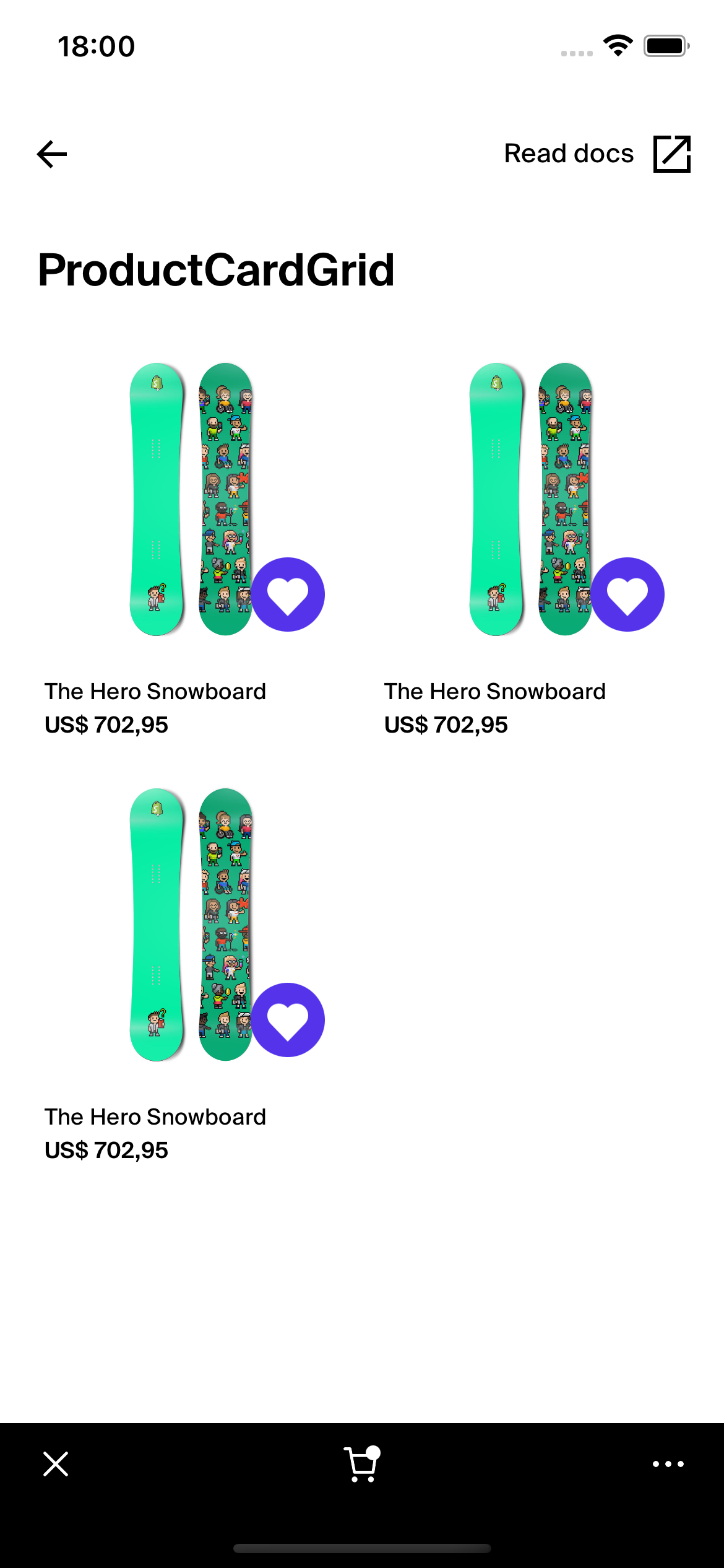
ProductCardGrid
This documentation is outdated and only applies to partners with existing Minis. Please check back soon for new platform announcements.
- The ProductCardGrid component is a versatile and visually gratifying way to display a grid of product cards within a React Native application. This component is particularly useful for eCommerce platforms where products need to be displayed efficiently and attractively.
The
ProductCardGridutilizes aFlatListto render a two-column grid of products. Each row is demarcated into left and right halves, corresponding to individual products. It can handle an uneven number of products by leaving the second column of the last row empty if necessary. The component takes a list of products and uses themakePairsutility function to pair them into tuples, facilitating the grid layout.This component supports forwarding refs, allowing direct access to the
FlatListmethods and properties, which expands its flexibility in handling large lists with performative rendering.Here’s a schematic example to demonstrate how you can deploy the
ProductCardGrid: <ProductCardGrid
products={productsArray}
renderItem={
({ product, index }) => (
<ProductCard
key={product.id}
product={product}
shopId="shopId"
/>
)
}
/>

Integration
Requirements:
- Ensure your project environment is set up with access to
@shopify/shop-minis-platform-sdk. See the quickstart for requirements and to set up a Shop Mini.
Step 1: Importing the Component
Begin by importing ProductCardGrid from your component directory:
import { ProductCardGrid } from '@shopify/shop-minis-platform-sdk';
Step 2: Implementing the ProductCardGrid
Incorporate the ProductCardGrid component into your page or component by providing it with an array of product data and a render item function:
<ProductCardGrid
  products={productList}
  renderItem={productRenderItem}
/>
Examples
Basic Use of ProductCardGrid:
<ProductCardGrid
  products={productData}
  renderItem={({ product, index }) => (
    <ProductCard
      key={product.id}
      product={product}
      shopId="shopId"
    />
  )}
/>
Advanced Use with Custom Separator and FlatList Props:
<ProductCardGrid
  products={productData}
  renderItem={productRenderItem}
  ItemSeparatorComponent={() => <Box height={20} />}
  showsVerticalScrollIndicator={false}
/>
Props
- products (
Array<ProductCardFragmentData | null>): Array of product data, possibly including nulls that are filtered out. - renderItem (
ProductRenderItem): Function that returns a React element for rendering each product. - ref (
React.Ref<FlatList>optional): Ref forwarding for direct manipulation of the FlatList. - otherFlatListProps (
FlatListProps<any>): Supports all FlatList props, giving flexibility to enhance or modify the list behavior.
For more details on the props, please refer to the ProductCardGrid Props.