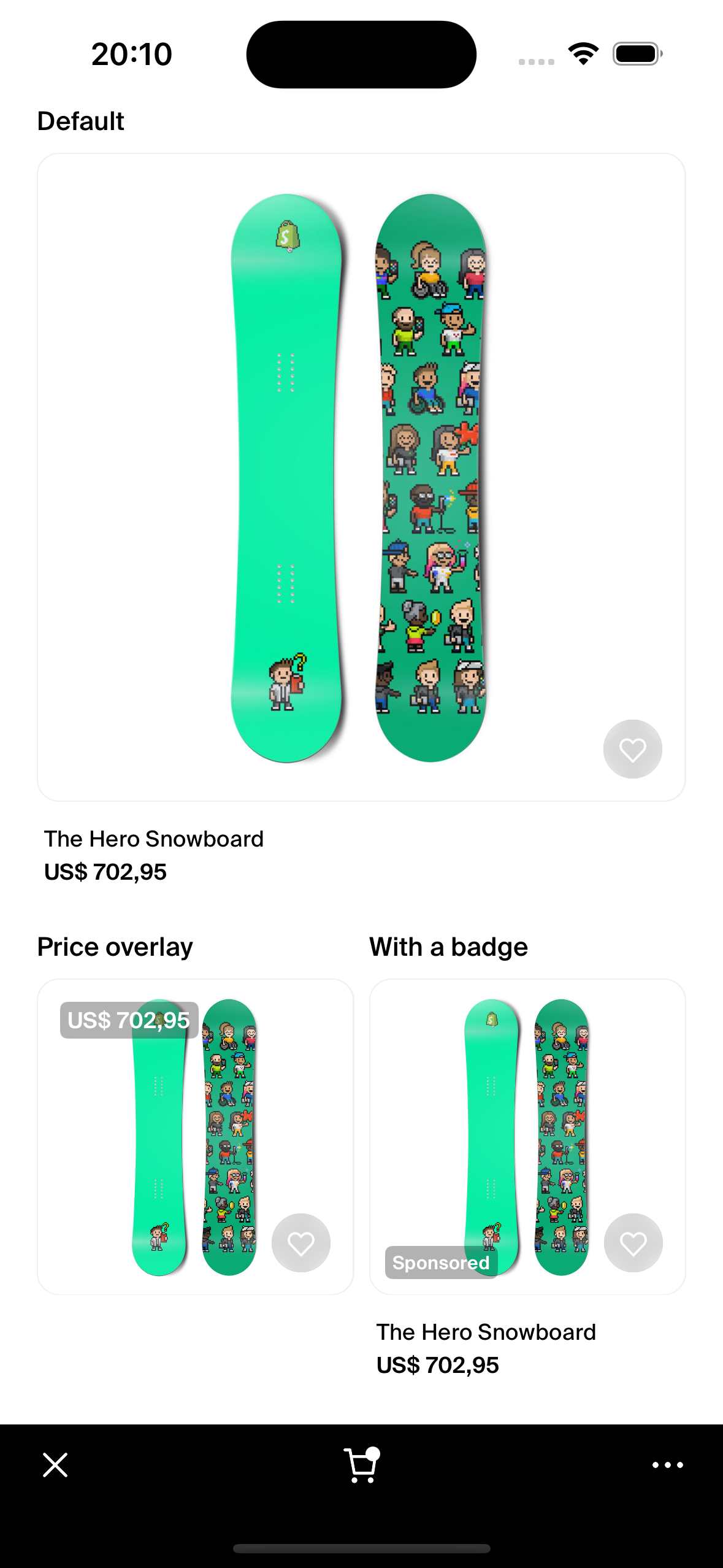
ProductCard
This documentation is outdated and only applies to partners with existing Minis. Please check back soon for new platform announcements.
- The ProductCard component serves as an essential UI element in ecommerce applications, designed to showcase products with an engaging and informative display. This component integrates various subcomponents like `ImageBox` for product images, `Text` for product titles or other descriptions, `ProductVariantPrice` to detail pricing, and `FavoritesButton` for managing user favorites.
The
ProductCardcan optionally display a badge with a customizable background color and text, adding a distinctive visual element that can highlight certain features of the product, such as 'New', 'Sale', or 'Limited'. Additionally, this component supports product impression tracking which can be enabled or disabled through props.Below, find an example usage of the
ProductCardcomponent: <ProductCard
shopId="shop123"
product={productData}
badgeText="Sponsored"
badgeVariant="sponsored"
onFavoriteToggled={
(isFavorited) => updateFavoriteStatus(isFavorited)
}
/>

Integration
Requirements:
- Ensure your project environment is set up with access to
@shopify/shop-minis-platform-sdk. See the quickstart for requirements and to set up a Shop Mini.
Step 1: Importing the Component
Source the ProductCard from your components directory:
import { ProductCard } from '@shopify/shop-minis-platform-sdk';
Step 2: Implementing the ProductCard Component
To utilize the ProductCard within your application, you need to supply it with product data, shop identifier, and any additional props as needed:
<ProductCard
  shopId="shopIdValue"
  product={productData}
  badgeText="Discount"
  badgeVariant="discountText"
  onFavoriteToggled={(isFavorited) => updateFavoriteStatus(isFavorited)}
/>
Examples
Basic ProductCard Application:
<ProductCard
  shopId="shop001"
  product={productData}
/>
Enhanced ProductCard with Badge and Favorites:
<ProductCard
  shopId="uniqueShopID"
  product={productData}
  badgeText="Sponsored"
  badgeVariant="sponsored"
  onFavoriteToggled={(isFavorited) => updateFavoriteStatus(isFavorited)}
  variant="priceOverlay"
/>
Props
- shopId (
string): Identifier of the shop to which the product belongs. - product (
ProductCardFragmentData): Data object containing details of the product.- id (
string): Unique identifier for the product. - title (
string): Name of the product. - description (
string, optional): Description of the product. - featuredImage (
FeaturedImage, optional): Primary image of the product. - defaultVariant (
DefaultVariant): Default variant of the product.
- id (
- badgeText (
string, optional): Text to display on the product badge. - badgeVariant (
BadgeVariant- required): Defines the visual style of the badge. - variant (
'default' | 'priceOverlay' | 'compact'- optional): Defines the visual style of the product card. - sectionId (
string, optional): Identification for product sections, used in tracking. - trackingDisabled (
boolean, optional): Flag to enable/disable impression tracking. - onFavoriteToggled (
(isFavorited: boolean) => void, optional): Callback when favorite status is toggled.
For more details on the props, please refer to the ProductCard Props.