PressableAnimated
caution
This documentation is outdated and only applies to partners with existing Minis. Please check back soon for new platform announcements.
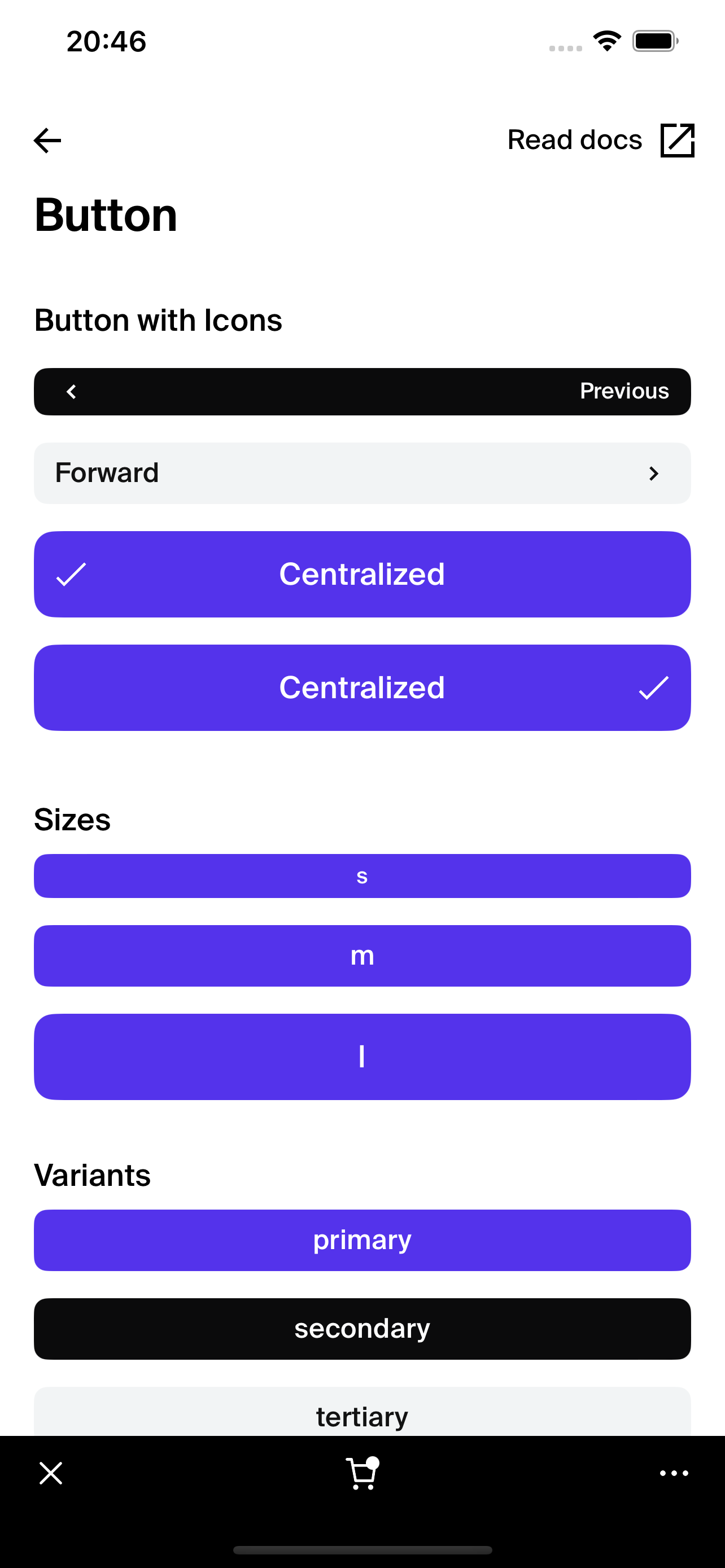
- The PressableAnimated component encapsulates a React Native `Pressable` component with enhanced visual and haptic feedback features. It is designed to provide an interactive button experience with customizable feedback behaviors, such as opacity changes, scaling animations, and haptic feedback on press. This component is ideal for creating engaging UI interactions in a React Native application where tactile and visual cues are crucial.
The component's flexible configuration allows it to be used as a button, link, or toggle button, depending on the
accessibilityRoleprovided. It is also equipped to handle potentially rapid interactions by adding debounce via a press delay, particularly useful when the component is part of a scrollable list.Here's a basic example of how to use the
PressableAnimatedcomponent: <PressableAnimated
onPress={handlePress}
bounceOnPress={true}
opacityOnPress={true}
hapticOnPress={true}>
<Text>Press Me!</Text>
</PressableAnimated>

Integration
Requirements:
- Ensure your project environment is set up with access to
@shopify/shop-minis-platform-sdk. See the quickstart for requirements and to set up a Shop Mini.
Step 1: Importing the Component
Import the PressableAnimated from your components directory:
import { PressableAnimated } from '@shopify/shop-minis-platform-sdk';
Step 2: Implementing the PressableAnimated Component
Utilize the PressableAnimated component in your UI, specifying the desired interactive behaviors:
<PressableAnimated
  onPress={() => console.log("Button pressed!")}
  disabled={false}
  opacityOnPress={true}
  hapticOnPress={true}
  bounceOnPress={true}>
  <Text>Clickable</Text>
</PressableAnimated>
Examples
Basic Button Usage:
<PressableAnimated onPress={() => alert('Clicked!')}>
  <Text>Tap Here</Text>
</PressableAnimated>
Disabled Button:
<PressableAnimated
  disabled={true}
  onPress={() => alert('Should not trigger')}>
  <Text>Disabled</Text>
</PressableAnimated>
Props
- children (
ReactNode): The content to display within the button. - onPress (
(children: ReactNode) => void): Function to call when the button is pressed. - accessibilityRole (
'button' | 'link' | 'togglebutton', optional): Semantic role of the pressable element. - disabled (
boolean, optional): If true, the button is non-interactive. - opacityOnPress (
boolean, optional): If true, changes the opacity of the button when pressed. - hapticOnPress (
boolean, optional): If true, triggers haptic feedback on press. - bounceOnPress (
boolean, optional): If true, applies a bounce animation on press. - isListItem (
boolean, optional): If true, adds a delay to the press action to prevent accidental activation when scrolling in a list.
For more details on the props, please refer to the PressableAnimated Props.