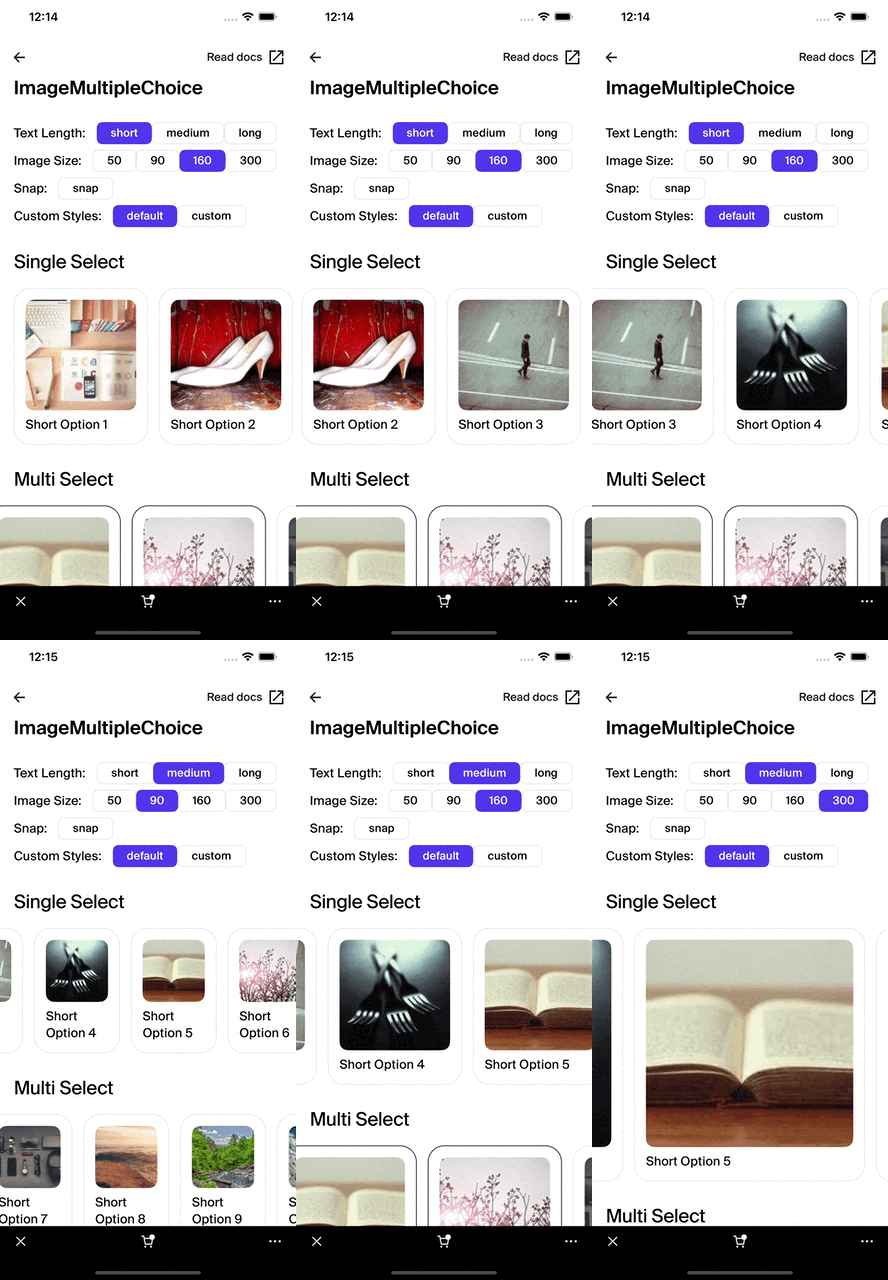
ImageMultipleChoice
caution
This documentation is outdated and only applies to partners with existing Minis. Please check back soon for new platform announcements.
- The ImageMultipleChoice component is a dynamic selector interface designed to display multiple images in a horizontal carousel, allowing users to make selections. It is particularly useful in scenarios where choices can be visually represented, such as selecting products, user avatars, or configurations that benefit from visual cues. This component supports multi-select functionality with an intuitive touch interface enhanced with features like snapping for a seamless user experience. Key attributes like the image size, selected indexes, and optional offset adjustments provide significant customization and flexibility to suit various application needs.
<ImageMultipleChoice
  choices={[
    {
      label: 'Option 1',
      value: 1,
      imageUrl: 'https://example.com/image1.jpg'},
    {
      label: 'Option 2',
      value: 2,
      imageUrl: 'https://example.com/image2.jpg'}
  ]}
  onChoiceSelected={handleChoiceSelected}
  selectedIndexes={[0]}
  imageSize={200}
/>

Integration
Requirements:
- Ensure your project environment is set up with access to
@shopify/shop-minis-platform-sdk. See the quickstart for requirements and to set up a Shop Mini.
Step 1: Importing the Component
Import ImageMultipleChoice at the top of your component file:
import { ImageMultipleChoice } from '@shopify/shop-minis-platform-sdk';
Step 2: Using the ImageMultipleChoice Component
Embed the ImageMultipleChoice in your UI by providing appropriate props:
<ImageMultipleChoice
  choices={[
    {label: 'Option A', value: 'A', imageUrl: 'https://example.com/a.jpg'},
    {label: 'Option B', value: 'B', imageUrl: 'https://example.com/b.jpg'}
  ]}
  onChoiceSelected={(index, value) => console.log(`Option ${value} selected`)}
  selectedIndexes={[1]}
  imageSize={150}
/>
Examples
Basic Usage:
<ImageMultipleChoice
  choices={[{label: 'First Choice', value: 1, imageUrl: 'https://example.com/choice1.jpg'}]}
  onChoiceSelected={(index, value) => console.log(value)}
  selectedIndexes={[]}
  imageSize={100}
/>
With Snap Effect:
<ImageMultipleChoice
  choices={[{label: 'Snap Item 1', value: '1', imageUrl: 'https://example.com/img1.jpg'}]}
  onChoiceSelected={(index, value) => console.log(value)}
  selectedIndexes={[0]}
  snap={true}
  imageSize={120}
  initialOffsetX={30}
/>
The ImageMultipleChoice enhances interactive media selection experiences in mobile applications, providing users with a clear, concise, and engaging way to make selections.
Additional Components
- Box: Used for styling and layout.
- PressableAnimated: Handles the press interactions.
- Spinner: Shows a loading indicator while images are loading.
- Text: Displays labels for each choice.
Props
- choices (
ImageChoiceType[]- required)**: Array of image options for the user to select. - onChoiceSelected (
Function- required): Function called when an image is selected. - selectedIndexes (
number[]- required): Indices of the images that should appear as selected. - imageSize (
number- required): The size of the images displayed. - snap (
boolean): If true, enables snapping behavior for the carousel. - initialOffsetX (
number): Initial horizontal offset for the carousel. - style (
ImageMultipleChoiceStyles): Custom style definitions for image and text styling, to allow overriding the default style. - animated (
boolean): If true, applies entrance animations to each item.
For more details on the props, please refer to the ImageMultipleChoice Props.