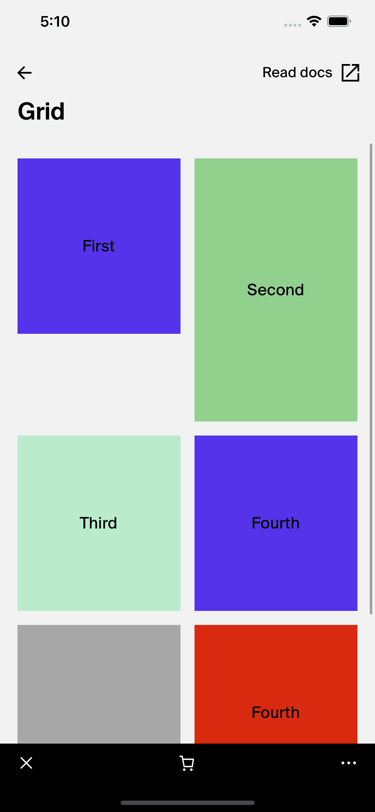
Grid
This documentation is outdated and only applies to partners with existing Minis. Please check back soon for new platform announcements.
- The Grid component is a customized React Native component designed to render items in a two-column grid layout using the `FlatList` component. It enhances the basic list functionality by automatically pairing items and arranging them side by side, making it ideal for displaying products, images, or any other data in a grid format.
This component takes an array of items and a rendering function as props. Each pair of consecutive items is rendered in a single row divided into two equal columns. If there is an odd number of items, the last row will contain a single item.
<Grid
  data={[{ id: 1, name: "First" }, { id: 2, name: "Second" }]}
  renderItem={({ item }) => <Box>{item.name}</Box>}
/>

Integration
Requirements:
- Ensure your project environment is set up with access to
@shopify/shop-minis-platform-sdk. See the quickstart for requirements and to set up a Shop Mini.
Step 1: Importing the Component
Start by importing Grid in your component file:
import { Grid } from '@shopify/shop-minis-platform-sdk';
Step 2: Using the Grid Component
Implement the Grid component by providing it the data and renderItem props. This setup allows the Grid to automatically handle the rendering of each item in a grid format:
<Grid
  data={[{ id: "1", name: "Product 1" }, { id: "2", name: "Product 2" }]}
  renderItem={({ item, index }) => (
    <Box>
      <Text>{item.name}</Text>
    </Box>
  )}
/>
Examples
Basic Grid Usage:
<Grid
  data={[{ id: "1", name: "Apple" }, { id: "2", name: "Orange" }]}
  renderItem={({ item }) => <Box padding="m">{item.name}</Box>}
/>
Complex Item Render:
<Grid
  data={[
    { id: "1", name: "Laptop", price: "999" },
    { id: "2", name: "Smartphone", price: "499" }
  ]}
  renderItem={({ item }) => (
    <Box padding="m">
      <Text>{item.name}</Text>
      <Text>{`Price: $${item.price}`}</Text>
    </Box>
  )}
/>
The Grid component provides a flexible and efficient way to display collections of data in a visually organized grid layout. It is suitable for various applications where items need to be displayed in a structured manner.
Additional Components
Box: Used within the Grid to provide padding and alignment.Text: Used for rendering text information about each item inside the grid.
Props
- data§ (
FlatListProps<ItemT>['data']): An array of items to display in the grid. - renderItem§ (
({ item, index }) => ReactNode): A function that returns a React element to render each item in the grid.
For more details on the props, please refer to the Grid Props.