Divider
This documentation is outdated and only applies to partners with existing Minis. Please check back soon for new platform announcements.
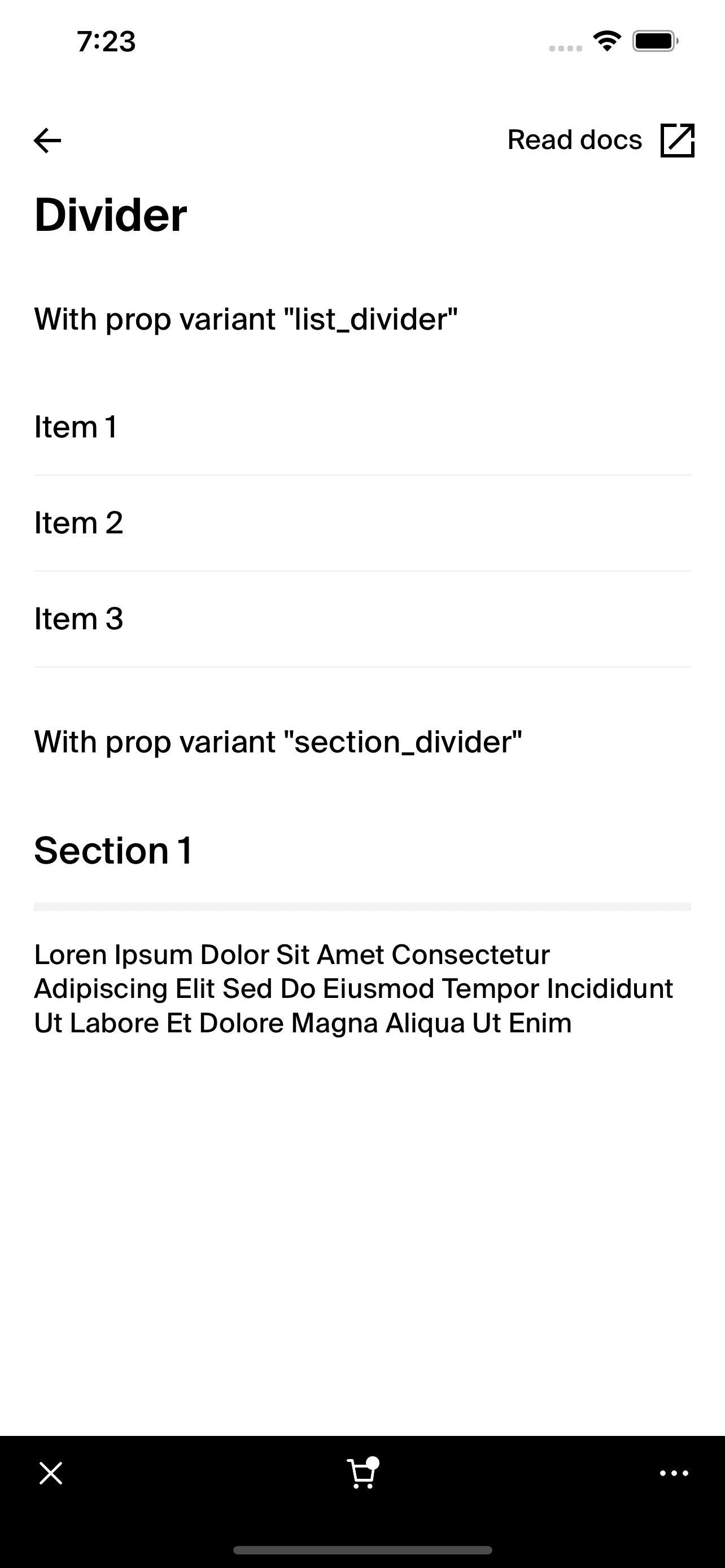
- The Divider component is a fundamental UI element used to visually separate content in React Native applications. It provides a clear distinction between sections or items within lists, enhancing the organizational structure of the interface. Dividers can be displayed either horizontally or vertically, depending on the layout needs, making them versatile tools for improving readability and aesthetic appeal.
This component comes with predefined variants such as 'section_divider' for pronounced separation in larger content areas and 'list_divider' for subtle separations within lists, each variant differing in thickness and color to suit specific design needs. The Divider is implemented using the
Boxcomponent, ensuring consistency and flexibility in style and spacing.Here's how to use the Divider component within your React Native project:
<Divider variant="section_divider" />

Integration
Requirements:
- Ensure your project environment is set up with access to
@shopify/shop-minis-platform-sdk. See the quickstart for requirements and to set up a Shop Mini.
Step 1: Importing the Component
Start by importing the Divider from your project's component library:
import { Divider } from '@shopify/shop-minis-platform-sdk';
Step 2: Using the Divider
Place the Divider component in your layouts or list views where you need to separate different blocks of content or list items. Configure it with the variant and vertical props to control its appearance and orientation:
<Divider variant="list_divider" />
Examples
Simple List Divider:
<Divider />
This example uses the default list divider settings for subtle separation in list structures.
Section Divider in a Vertical Layout:
<Divider variant="section_divider" vertical />
Here, the divider is used vertically with a thicker style, suitable for side menus or split layouts.
Props
- variant (
Variant, optional): Determines the style of the divider based on its usage context ('section_divider' or 'list_divider'). - vertical (
boolean, optional): Orientates the divider vertically if set to true; otherwise, it is horizontal. - Inherits other props from
BoxPropssuch asmargin,padding, allowing further customization of its positioning and spacing.