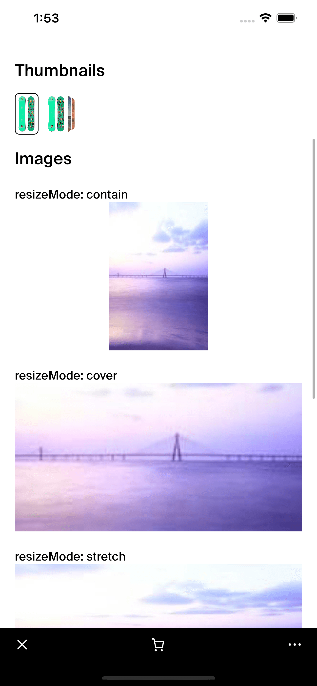
CollectionThumbnail
- The CollectionThumbnail component is designed to display a stack of overlapped images intended to represent items in a collection. This component is particularly useful for showcasing collections like albums, product stacks, or gallery previews in a compact and visually appealing manner.
The component leverages
TouchableOpacityfor user interaction, allowing it to respond to touches. With overlapped images that resize and adjust based on the number of items, it can dynamically cater to various use cases and fit seamlessly within different UI layouts. <CollectionThumbnail
imageSources={[
{ uri: 'https://example.com/image1.jpg' },
{ uri: 'https://example.com/image2.jpg' }
]}
borderColor="white"
onPress={() => console.log("Thumbnail Pressed")}
/>

Integration
Requirements:
- Ensure your project environment is set up with access to
@shopify/shop-minis-platform-sdk. See the quickstart for requirements and to set up a Shop Mini.
Step 1: Importing the Component
Firstly, ensure the CollectionThumbnail component is accessible by importing it at the top of your file:
import { CollectionThumbnail } from '@shopify/shop-minis-platform-sdk';
Step 2: Using the CollectionThumbnail Component
Incorporate the CollectionThumbnail into your component structure by utilizing it within your layouts, offering users a visual representation of collections:
<CollectionThumbnail
  imageSources={[
    { uri: 'https://example.com/image1.jpg' },
    { uri: 'https://example.com/image2.jpg' }
  ]}
  borderColor="white"
  onPress={() => console.log("Pressed")}
/>
Examples
Basic Usage:
<CollectionThumbnail
  imageSources={[
    { uri: 'https://example.com/image1.jpg' }
  ]}
  borderColor="white"
/>
With Multiple Images and Interaction:
<CollectionThumbnail
  imageSources={[
    { uri: 'https://example.com/image1.jpg' },
    { uri: 'https://example.com/image2.jpg' },
    { uri: 'https://example.com/image3.jpg' }
  ]}
  borderColor="gray"
  onPress={() => console.log("Thumbnail Pressed")}
/>
The CollectionThumbnail component enhances user interaction and visual engagement by displaying multiple items in a neat, overlapped layout. It is efficient, responsive, and customizable, suitable for various applications where showcasing multiple items simultaneously is beneficial.
Additional Components
ImageBox: A sub-component that handles individual image rendering with specific styles and transformations.TouchableOpacity,Box: Utilized for building the primary structure and ensuring usability through touch interactions.
Props
- imageSources (
NonNullable<FastImageProps['source']>[]): An array of image sources to display as thumbnails. - borderColor (
BoxProps['backgroundColor']): The color of the border around each image thumbnail. - onPress (
() => voidoptional): An optional callback function that executes when the thumbnail is pressed.
For more details on the props, please refer to the CollectionThumbnail Props.