Button
This documentation is outdated and only applies to partners with existing Minis. Please check back soon for new platform announcements.
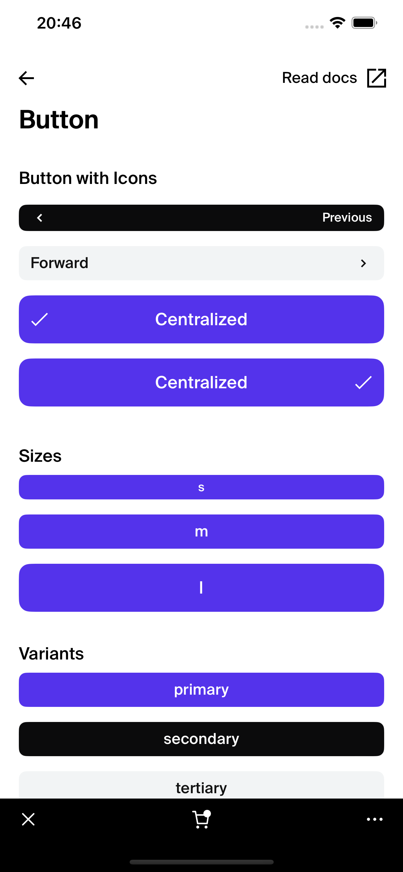
- The Button component is a core interactive element within React Native applications, designed to capture user interactions with enhanced visual feedback. It supports a variety of sizes, states, and styles, making it adaptable for various interface needs.
This component utilizes
PressableAnimatedfor dynamic interaction effects, such as opacity changes and bounce animations on press. It is highly customizable, supporting themes, icons, and multiple variants. <Button
text="Press Me"
onPress={() => console.log('Button Pressed')}
size="m"
variant="primary"
/>

Integration
Requirements:
- Ensure your project environment is set up with access to
@shopify/shop-minis-platform-sdk. See the quickstart for requirements and to set up a Shop Mini.
Step 1: Importing the Component
Ensure the Button component is accessible in your project by importing it at the start of your file:
import {Button} from '@shopify/shop-minis-platform-sdk'
Step 2: Using the Button Component
Implement the Button in your UI by including it in your component's return statement, configured with desired props:
<Button
  text="Click Here"
  onPress={() => console.log('Clicked')}
  size="m"
  variant="overlay"
/>
Examples
Basic Usage:
<Button text="Hello World" onPress={() => console.log('Greetings')} />
With Custom Styles and Disabled State:
<Button
  text="Disabled Button"
  onPress={() => console.log('Should not appear')}
  disabled={true}
  style={{backgroundColor: 'grey', borderColor: 'darkgrey'}}
/>
Overlay Variant with iOS Blur Effect:
<Button
  variant="overlay"
  text="View More"
  onPress={() => console.log('Viewing More')}
  size="l"
/>
The Button component is essential for any interactive application interface, providing clear and responsive user feedback. By following these integration steps and examples, you can efficiently utilize the Button component in your app, enhancing the user experience with well-designed, interactive elements.
Additional Components
PressableAnimated: A sub-component for handling press animations.Text,Box: Used for layout and text styling within the button.
Props
- onPress (
function): The function to call when the button is pressed. - disabled (
boolean): If true, the button will be non-interactive. - size (
ButtonSize): Defines the size of the button (s,m,l). - style (
ViewStyle & TextStyle): Additional styles to apply to the button. - text (
string): The text to display on the button. - opacityOnPress (
boolean): If true, button opacity changes on press. - bounceOnPress (
boolean): If true, button has a bounce animation on press. - isListItem (
PressableAnimatedProps['isListItem']): If true, button styling adjusts as per list item requirements. - leftIcon, rightIcon (
Icons): Icons to display on the left or right side of the text. - textAlign (
'left' | 'center' | 'right'): Alignment of the text within the button.
For more details on the props, please refer to the Button Props.