Badge
This documentation is outdated and only applies to partners with existing Minis. Please check back soon for new platform announcements.
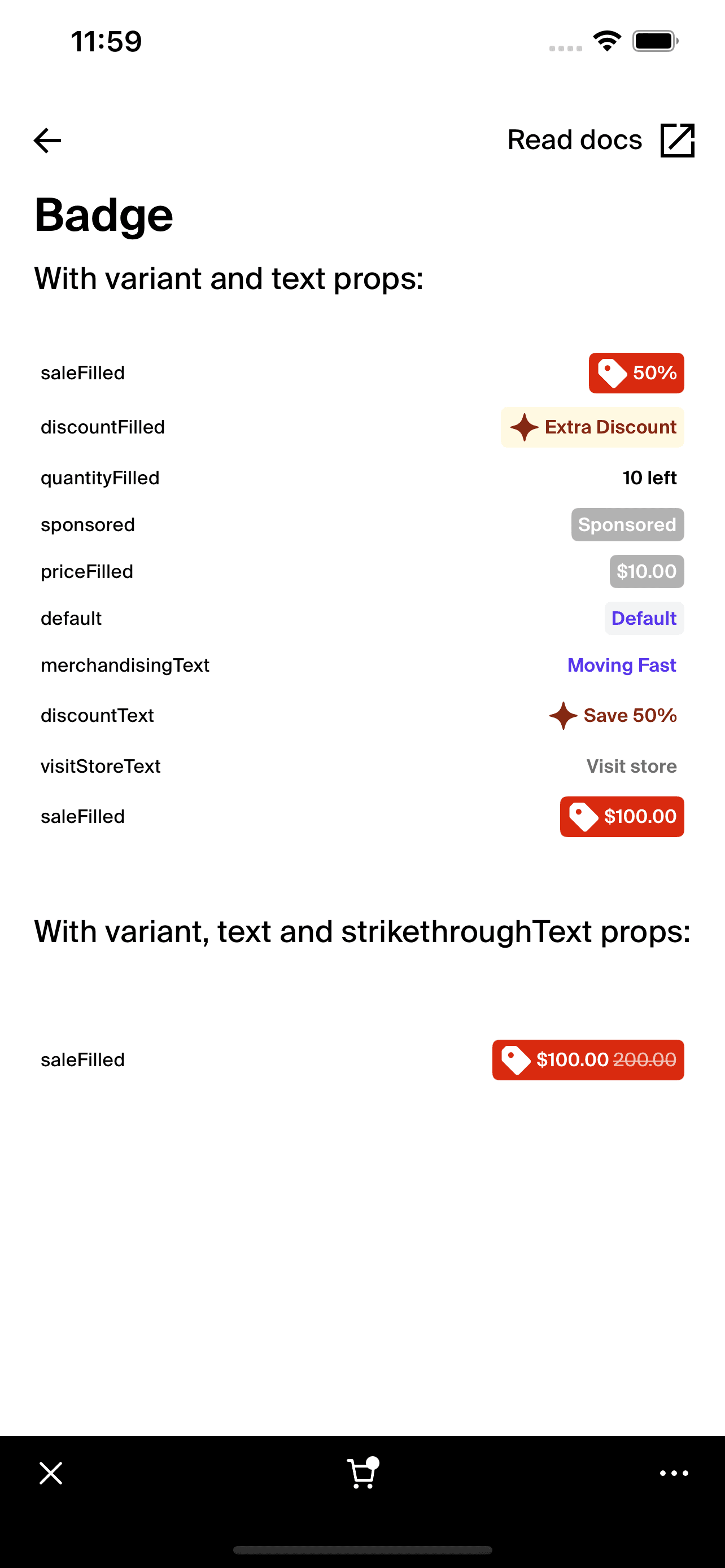
- The Badge component is a versatile tool designed to display various types of information like discounts, notifications, or statuses within an application. Its functionality is enhanced by different variants that dictate the badge's appearance, making it suitable for multiple contexts and styles.
The badge dynamically utilizes colors and optionally incorporates icons, enabling it to stand out or blend within the user interface as required. It offers an optional strikethrough text feature, beneficial for displaying discounted prices or similar information.
<Badge
  variant="saleFilled"
  text="50% off"
  strikethroughText="200.00"
  accessibilityLabel="50% off badge"
/>

Integration
Requirements:
- Ensure your project environment is set up with access to
@shopify/shop-minis-platform-sdk. See the quickstart for requirements and to set up a Shop Mini.
Step 1: Importing the Badge Component
Import the Badge at the top of your component files where it is to be utilized:
import { Badge } from '@shopify/shop-minis-platform-sdk';
Step 2: Using the Badge Component
Implement the Badge by specifying its variant, text, and optionally, strikethrough text if needed. Configuration can be further customized through accessibilityLabel:
<Badge
  variant="saleFilled"
  text="30% off"
  strikethroughText="$100.00"
  accessibilityLabel="30% discount badge"
/>
Examples
Basic Usage:
<Badge
  variant="saleFilled"
  text="50% off"
/>
With Strikethrough Text:
<Badge
  variant="saleFilled"
  text="Special Offer"
  strikethroughText="$200.00"
/>
Accessibility Options:
<Badge
  variant="newArrival"
  text="New"
  accessibilityLabel="New arrival"
/>
The Badge is essential for applications needing to highlight specific information effectively. It supports responsive design, accessibility, and can adapt to various display needs.
Additional Components
Text: Utilized to display the badge's text.Box: Provides the layout and background for the badge.Icon: Optionally included for enhanced visual representation.
Props
- variant (
BadgeVariant- required): Defines the visual style of the badge. - text (
string- required): The text content displayed within the badge. - strikethroughText (
string): Optional text shown with a strikethrough effect. - accessibilityLabel (
string): Provides a label for screen readers to improve accessibility.
For more details on the props, please refer to the Badge Props.