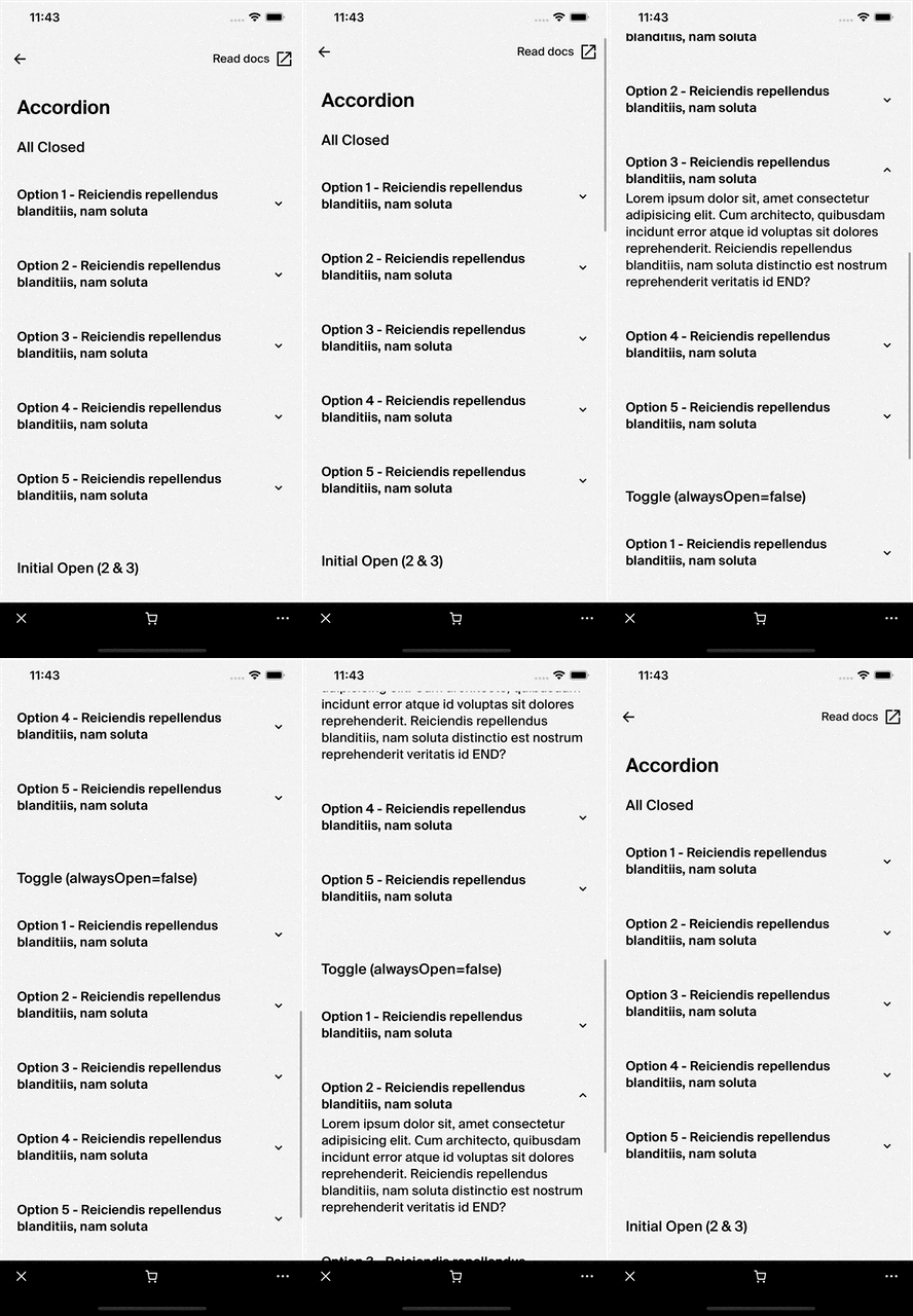
Accordion
This documentation is outdated and only applies to partners with existing Minis. Please check back soon for new platform announcements.
- The Accordion component is a versatile React component that renders a list of expandable/collapsible items, commonly known as accordion items. This component is suitable for scenarios where you need to display detailed information conditionally, such as FAQs, menus, or more complex lists where space conservation is important.
const accordionItems = [
  {
    title: "Item One",
    body: <Text>I am body One</Text>
  },
  {
    title: "Item Two",
    body: <Text>I am body Two</Text>
  },
];

return (
  <Accordion
    items={accordionItems}
    alwaysOpen={false}
    onItemTitlePress={(index, title) => console.log(`Clicked ${title}`)}
  />

);

Integration
Requirements:
- Ensure your project environment is set up with access to
@shopify/shop-minis-platform-sdk. See the quickstart for requirements and to set up a Shop Mini.
Step 1: Importing the Component
First, you need to import the Accordion component from the @shopify/shop-minis-platform-sdk package. Place the following import statement at the top of your file:
import { Accordion } from '@shopify/shop-minis-platform-sdk';
Step 2: Preparing the Data
The Accordion component requires an items prop that contains an array of objects. Each object in the array should represent a single accordion item and must include properties for title and body. Optionally, you may specify isInitiallyOpen to control the initial visibility of the accordion content:
const accordionItems = [
  {
    title: "Item 1",
    body: "Content for Item 1",
    isInitiallyOpen: true
  },
  {
    title: "Item 2",
    body: "Content for Item 2",
    isInitiallyOpen: false
  }
];
Step 3: Using the Accordion Component
With the component imported and data prepared, you can now use the Accordion in your Mini. Add the Accordion component to the desired location in your component’s return statement, and pass the items prop:
<Accordion items={accordionItems} />
Examples
Basic Usage
Here's a simple example demonstrating how to render an accordion with two items:
import {
  Box,
  Text,
  Accordion,
  SafeAreaView,
} from '@shopify/shop-minis-platform-sdk'
import {ScrollView} from 'react-native'

const accordionItems = [
  {
    title: "Item One",
    body: <Text>I am body One</Text>
  },
  {
    title: "Item Two",
    body: <Text>I am body Two</Text>
  },
]

export const AccordionScreen = () => {
  return (
    <SafeAreaView style={{flex: 1}}>
      <ScrollView style={{flex: 1}}>
        <Box padding="medium">
          <Text>Hi, I am a text above the accordion</Text>
          <Accordion items={accordionItems} />
        </Box>
      </ScrollView>
    </SafeAreaView>
  )
}
Controlling the Open State
If you want only one item to be open at a time, set alwaysOpen to false:
<Accordion items={accordionItems} alwaysOpen={false} />
Handling Title Press
To perform an action when a title is pressed, use onItemTitlePress. For example, logging the index and title:
const handleItemTitlePress = (index, title) => {
  console.log(`Item "${title}" at index ${index} clicked!`);
};

return (
  <Accordion items={accordionItems} onItemTitlePress={handleItemTitlePress} />
);
Make sure the Accordion component and the types are properly implemented to ensure full functionality.
Props
- items (
AccordionItemData[]- required): Array of data objects each containing atitleand abody. - alwaysOpen (
boolean): Iftrue, multiple sections can be expanded at the same time. - onItemTitlePress (
(index: number, title: string) => void): Callback function that is called when an accordion item title is pressed.
For more details on the props, please refer to the Accordion Props.