Features
Some features of the minis platform can be toggled on or off, the features that you opt-in to are recorded in your manifest.json file. Changes will apply locally after you restart your development server. Changes will take effect for end users in production after you submit your Shop Mini and that submission has been released in the next version of Shop.
The Shop Minis CLI can be used to enable or disable features, as well as list all available features. See the CLI docs for more information.
Features
Full Bleed Viewer
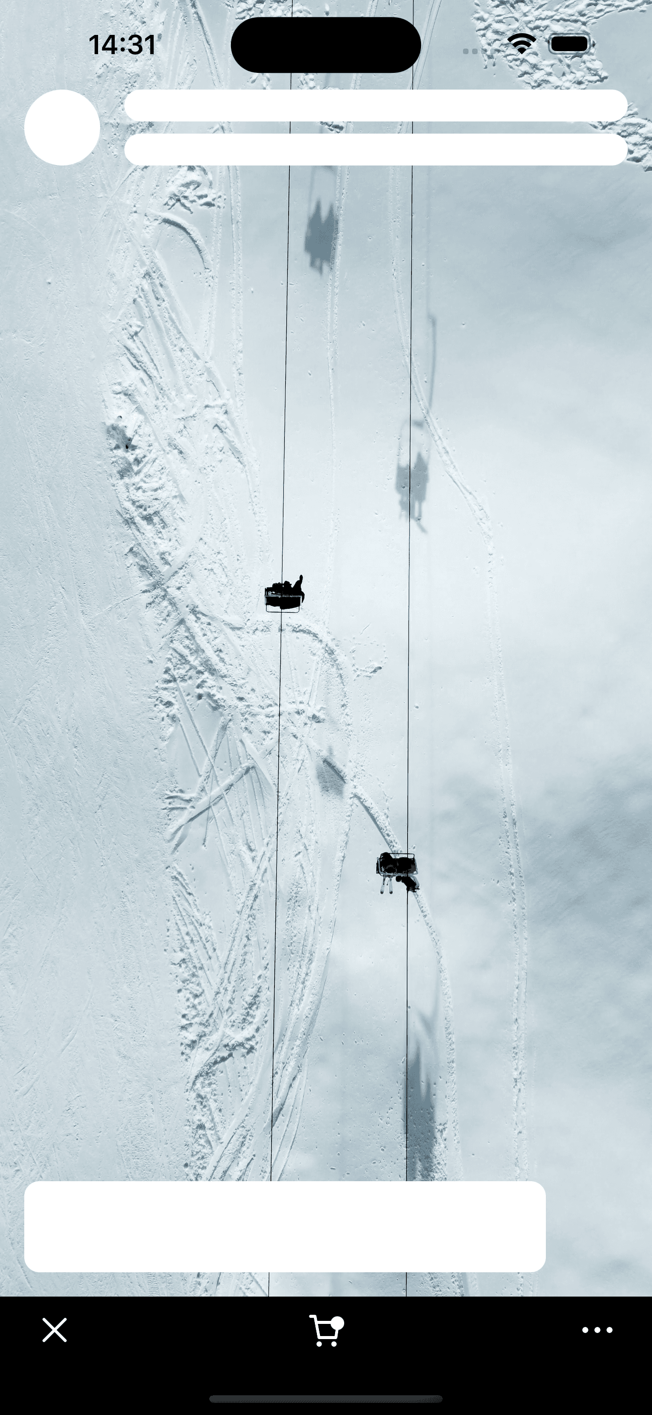
When the FULL_BLEED_VIEWER feature is enabled your Shop Mini will be allowed to extend to the top of the screen. You can use this space to extend images/videos or simply to extend a background color - it's up to you but it's important you keep foreground content visible and interactive.

import {StyleSheet, StatusBar} from 'react-native'
import Video from 'react-native-video'
import {Box, SafeAreaView} from '@shopify/shop-minis-platform-sdk'

export function App() {
  return (
    <Box flex={1} backgroundColor="backgrounds-regular">
      <StatusBar barStyle="dark-content" />

      <Video
        source={{
          uri: 'https://cdn.shopify.com/videos/c/o/v/197d24d529fd4d5685d88b8e7a0e99b3.mp4',
        }}
        resizeMode="cover"
        repeat
        style={{height: '100%', width: '100%'}}
      />

      <SafeAreaView style={[StyleSheet.absoluteFillObject]}>
        <Box flex={1} justifyContent="space-between">
          <Box paddingHorizontal="gutter" flexDirection="row" gap="s">
            <Box
              width={50}
              height={50}
              borderRadius={80}
              backgroundColor="backgrounds-regular"
            />

            <Box flex={1} gap="xs">
              <Box
                flex={1}
                borderRadius={80}
                backgroundColor="backgrounds-regular"
              />

              <Box
                flex={1}
                borderRadius={80}
                backgroundColor="backgrounds-regular"
              />
            </Box>
          </Box>

          <Box
            padding="m"
            margin="gutter"
            width="80%"
            height={60}
            borderRadius={10}
            backgroundColor="backgrounds-regular"
          />
        </Box>
      </SafeAreaView>
    </Box>
  )
}
When using the full bleed viewer there are some things to consider
Background content/color
Your main component should flex to the entire space available and set a background color. This ensures all of your screens, including loading and error states, have the correct background across the whole screen. You can put the rest of your app in a <SafeAreaView /> if you chose but you should always have a background set outside this area.
import {StatusBar} from 'react-native'
import {Box, SafeAreaView, Text} from '@shopify/shop-minis-platform-sdk'

export function App() {
  return (
    <Box flex={1} backgroundColor="backgrounds-regular">
      <StatusBar barStyle="dark-content" />

      <SafeAreaView style={{flex: 1}}>
        <Text textAlign="center">Hello, World!</Text>
      </SafeAreaView>
    </Box>
  )
}
Status bar
Pick a <StatusBar /> that suits your content, commonly you will use <StatusBar barStyle="light-content" /> or <StatusBar barStyle="dark-content" />. You can change this per screen if you wish.
If you are putting dynamic content behind the status bar such as images or videos you should ensure the status bar text retains good contrast regardless of light/dark content. We find a gradient works well for this:
import {StatusBar} from 'react-native'
import LinearGradient from 'react-native-linear-gradient'
import {Box, SafeAreaView, Text} from '@shopify/shop-minis-platform-sdk'

export function App() {
  return (
    <Box flex={1} backgroundColor="backgrounds-regular">
      <StatusBar barStyle="light-content" />

      <Box position="absolute" top={0} left={0} right={0}>
        <LinearGradient colors={['rgba(0, 0, 0, 0.4)', 'rgba(0, 0, 0, 0)']}>
          <Box height={340} width="100%" />
        </LinearGradient>
      </Box>

      <SafeAreaView style={{flex: 1}}>
        <Text textAlign="center" color="foregrounds-regular-inverse">
          Hello, World!
        </Text>
      </SafeAreaView>
    </Box>
  )
}
Scrolling content
A common use-case is to have a full-height scrolling view with pages where each page has content that needs to stay in the safe area of the screen such as a header, merchant information and product links. In this case the standard <SafeAreaView /> will not work so you can use useSafeAreaInsets() instead. This allows you to use the safe area values directly to apply spacing to each page.
import {useCallback} from 'react'
import {FlatList, Image, ListRenderItemInfo, StatusBar} from 'react-native'
import LinearGradient from 'react-native-linear-gradient'
import {
  Box,
  useSafeAreaInsets,
  useMinisDimensions,
} from '@shopify/shop-minis-platform-sdk'

export function App() {
  const {height} = useMinisDimensions()
  const insets = useSafeAreaInsets()
  const images = [
    'https://images.unsplash.com/photo-1682686578289-cf9c8c472c9b?q=80&w=1740&auto=format&fit=crop&ixlib=rb-4.0.3&ixid=M3wxMjA3fDF8MHxwaG90by1wYWdlfHx8fGVufDB8fHx8fA%3D%3D',
    'https://images.unsplash.com/photo-1700475477254-5986ff2f1dc3?q=80&w=1587&auto=format&fit=crop&ixlib=rb-4.0.3&ixid=M3wxMjA3fDB8MHxwaG90by1wYWdlfHx8fGVufDB8fHx8fA%3D%3D',
    'https://images.unsplash.com/photo-1700566070913-12fe438ffb7c?q=80&w=1587&auto=format&fit=crop&ixlib=rb-4.0.3&ixid=M3wxMjA3fDB8MHxwaG90by1wYWdlfHx8fGVufDB8fHx8fA%3D%3D',
  ]

  const renderImageItem = useCallback(
    ({item: imageUrl}: ListRenderItemInfo<string>) => {
      return (
        <Box height={height} key={imageUrl}>
          <Image
            style={{flex: 1}}
            resizeMode="cover"
            source={{
              uri: imageUrl,
            }}
          />

          <Box position="absolute" top={0} left={0} right={0}>
            <LinearGradient colors={['rgba(0, 0, 0, 0.4)', 'rgba(0, 0, 0, 0)']}>
              <Box height={340} width="100%" />
            </LinearGradient>
          </Box>

          <Box
            position="absolute"
            top={insets.top}
            bottom={0}
            left={0}
            right={0}
            justifyContent="space-between"
          >
            <Box paddingHorizontal="gutter" flexDirection="row" gap="s">
              <Box
                width={50}
                height={50}
                borderRadius={80}
                backgroundColor="backgrounds-regular"
              />

              <Box flex={1} gap="xs">
                <Box
                  flex={1}
                  borderRadius={80}
                  backgroundColor="backgrounds-regular"
                />

                <Box
                  flex={1}
                  borderRadius={80}
                  backgroundColor="backgrounds-regular"
                />
              </Box>
            </Box>

            <Box
              padding="m"
              margin="gutter"
              width="80%"
              height={60}
              borderRadius={10}
              backgroundColor="backgrounds-regular"
            />
          </Box>
        </Box>
      )
    },
    [height, insets.top]
  )

  return (
    <Box flex={1} backgroundColor="foregrounds-contrasting-inverted">
      <StatusBar barStyle="light-content" />

      <FlatList
        style={{flex: 1}}
        data={images}
        renderItem={renderImageItem}
        snapToInterval={height}
        decelerationRate="fast"
      />
    </Box>
  )
}
Testing
When using this feature it's important to test your prototypes on different devices with a variety of overlay styles eg. older devices with no notch, notched devices, newer iPhone models with a dynamic island etc... It's also important to test on Android devices which often have different spacing around their safe areas.
Dimensions
It's important to note that with this feature enabled the values returned from useMinisDimensions() refer to the whole minis viewer area not just the safe area. To get the sizing of just the safe area you can combine these minis dimensions with useSafeAreaInsets() like so:
const {height: totalHeight} = useMinisDimensions()
const {top: insetTop} = useSafeAreaInsets()
const safeAreaHeight = totalHeight - insetTop
Standalone Mini
This is a new feature and there might be changes. Use with caution and keep packages up to date.
When the STANDALONE feature is enabled your Shop Mini can exist without a connection to a specific Shop, Product or Order.
It can use all available information about Shops and Products and will be surfaced on the user's account page for development and across the Shop App.
Approval and selection of Standalone Minis for different surfaces is overseen by the Shop team and can vary on case by case basis.